
Conversion design · Sendible · 2022–2026 · 24 min read
Twenty experiments on one funnel
Four years testing a homepage, a pricing page, a demo page and a sign-up flow, and learning that the easiest metric to move is rarely the one that matters.
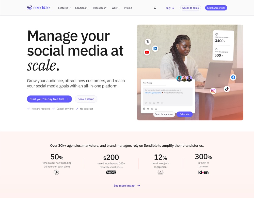
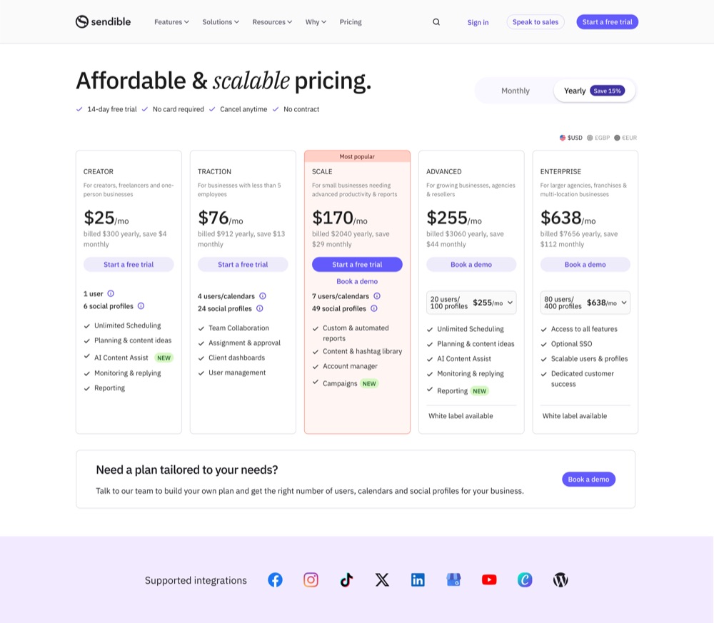
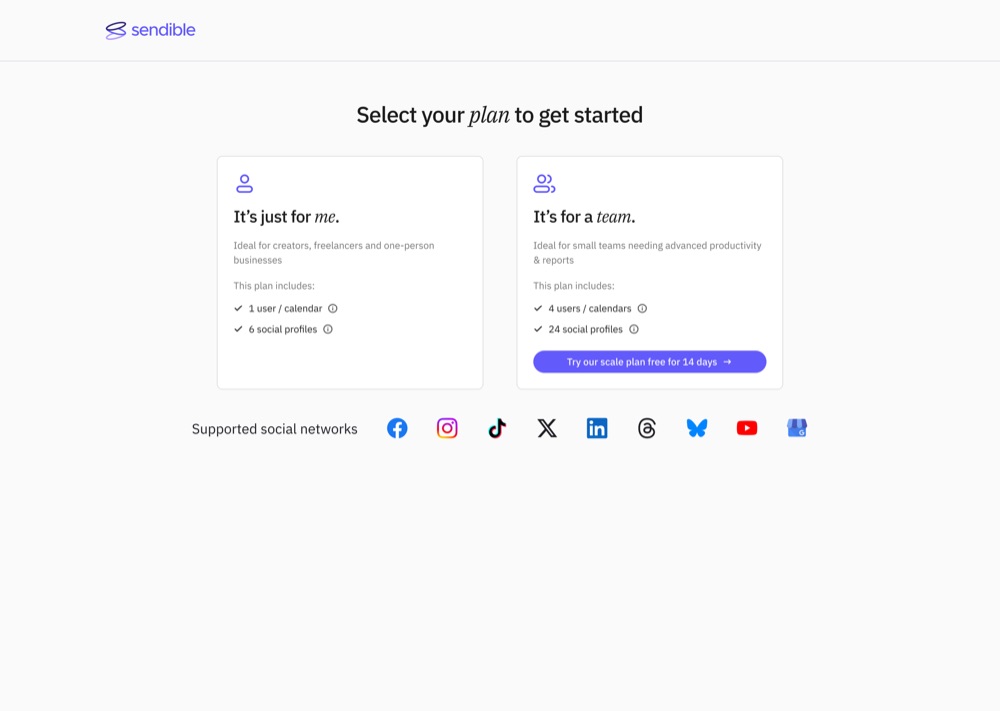
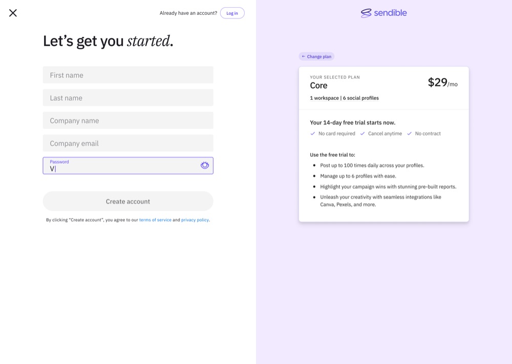
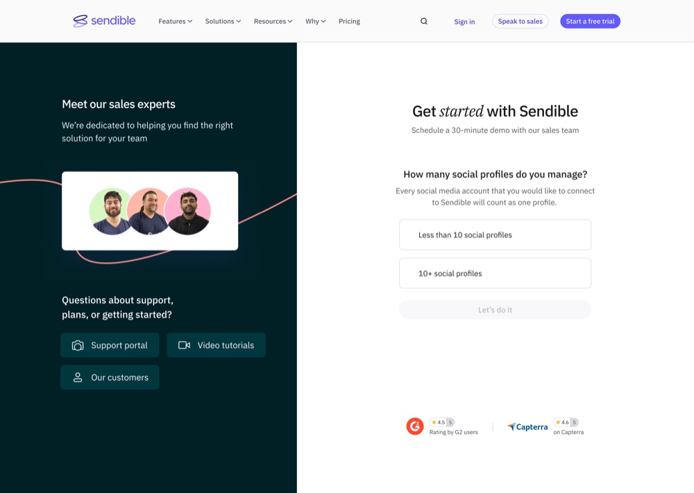
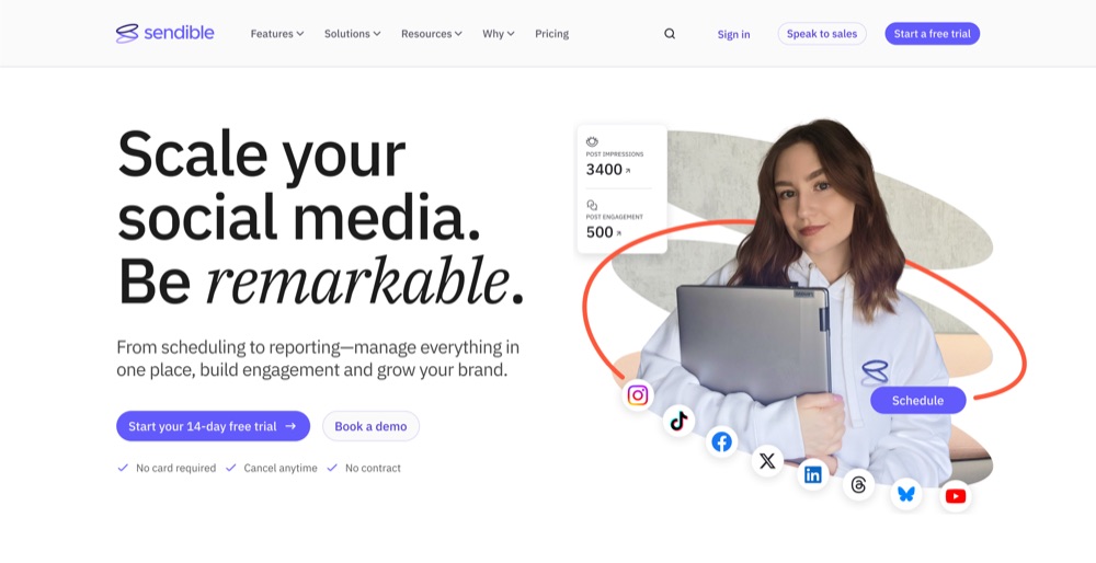
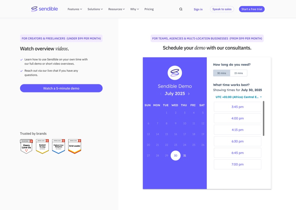
Copy, SEO and campaign strategy sat with colleagues. Design and experiment execution sat with me.
- 3.11%
- new-visitor-to-trial quarterly average, past the 3% target (from 1.9%)
- 1 week
- pricing handoff-to-live, down from two weeks
- +66%
- August demo pipeline over July, and still climbing
- 61.80%
- sign-up to trial, up from a 27.6% July average
What I did
- Designed and ran the experiments that lifted new-visitor-to-trial from 1.9% to a 3.11% quarterly average, then when conditions reversed audited the homepage against its own data and mapped the funnel by route, finding three pages doing three different jobs
- Built the ICE scoring framework and the per-test design template of hypothesis, data rationale and guardrail metrics behind more than twenty experiments, and wrote the growth-driven design process the team worked to
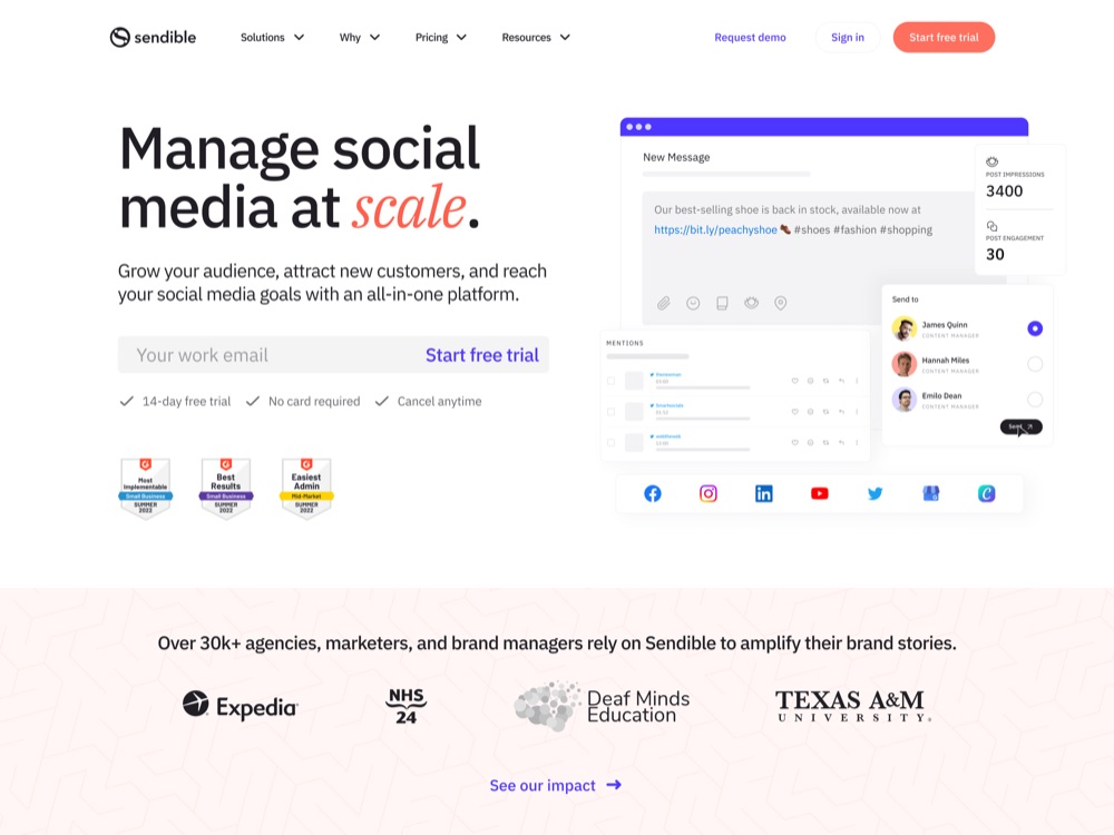
- Rebuilt the homepage four times, from an A/B test stopped early because the new design was clearly ahead to a July 2026 restructure of six changes drawn from a 33-idea inventory
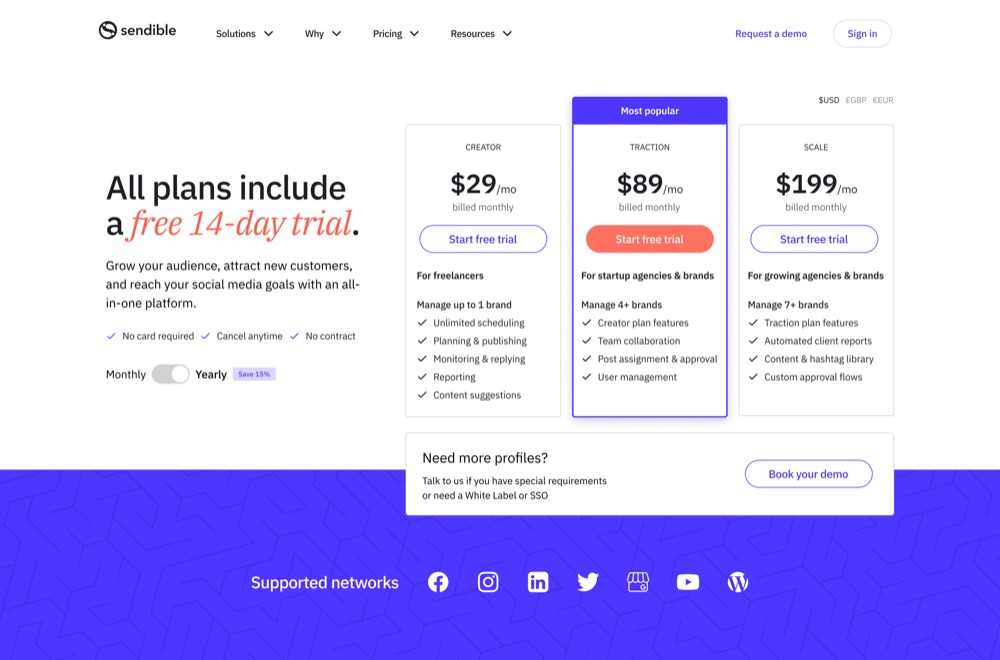
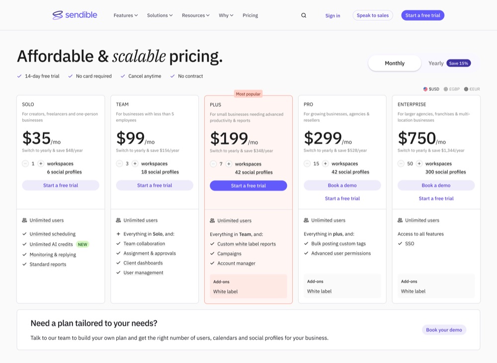
- Rebuilt the pricing page three times, lifting trial conversion from 4% to 6% and Traction adoption from 20% to 31%, and restructuring the plans into five tiers with monthly, annual and currency toggles
- Built the 2026 pricing page as a coded prototype with its content manager, cutting handoff-to-live from two weeks to one and letting the team operate the content model rather than read a spec
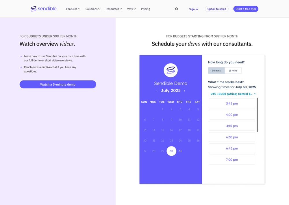
- Rebuilt the demo page as a routing problem, splitting the two paths and rewriting the page to argue for the call, with August pipeline 66% above July and still climbing
- Rebuilt the sign-up page from a heatmap read into a plan-aware panel, retiring the plan selection page whose premise a year of testing had disproved, and took sign-up to trial from a 27.6% July average to 61.80%
The problem
The scorecard opened Q4 2023 at 1.9%. By Q1 2024 the site was averaging 3.11%, against a 3.00% quarterly target, and it cleared that target in every month of the quarter.
That was the good year. What followed was harder.
Traffic held. Conditions changed. By 2026 the homepage was converting 0.78% of visitors to a click on its primary call to action, and the brief had shifted from growth to recovery. The question stopped being how to get more out of a page that was working and became why a page that had worked was no longer working.
New-visitor-to-trial · Q4 2023 – Q1 2024
One quarter above the 3% target
| Month | Conversion |
|---|---|
| Scorecard open | 1.90% |
| Oct 2023 | 2.09% |
| Nov | 2.19% |
| Dec | 1.98% |
| Jan 2024 | 3.07% |
| Feb | 3.02% |
| Mar | 3.24% |
| Quarterly target | 3.00% |
The diagnosis
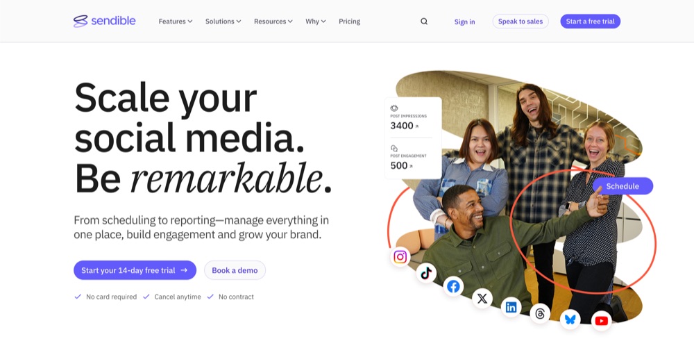
I audited the homepage against its own data before proposing anything. It was carrying 25,000 to 30,000 views a month, so every percentage point below was a few hundred people.
99.22% of visitors didn’t click either of the two calls to action in the hero. The interactive product demo, the most technically ambitious module on the page, recorded one click across 9,515 impressions. The customer logo strip recorded two.
But visitors who did click a call to action converted to trial at 20.82%, and those who submitted a form directly converted at 35.5%.
The page wasn’t failing to convert people who engaged with it. It was failing to get anyone to engage.
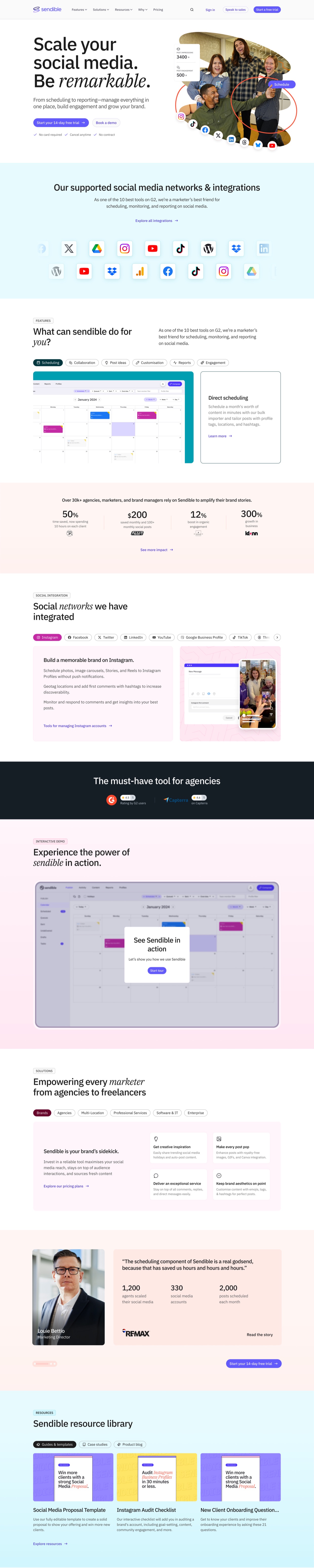
| Section | Position | Still on page | Desktop visitors | Module performance |
|---|---|---|---|---|
| Hero and primary CTA | 2–12% | 99.81% at 5% | 15,991 | 0.78% clicked the primary CTA |
| Social networks | 12–19% | 13.82% at 15% | 2,214 | 0.02% logo strip, 2 clicks |
| Features | 19–30% | 7.97% at 20% | 1,277 | n/a |
| Stats band | 30–32% | 6.45% at 30% | 1,033 | n/a |
| 32–44% | 5.75% at 35% | 921 | n/a | |
| Review badges | 44–47% | 4.98% at 45% | 798 | n/a |
| Interactive demo | 47–58% | 4.71% at 50% | 755 | 0.01%, 1 click of 9,515 |
| Solutions | 58–68% | 4.05% at 60% | 649 | n/a |
| RE/MAX customer story | ~80% | 3.36% at 80% | 538 | 46% of engaged converted |
| Resource library | ~90% | 2.98% at 90% | 478 | n/a |
| Footer | 95–100% | 2.56% at 95% | 410 | n/a |
| Between 10% and 15% scrolled, retention falls from 60.53% to 13.82%, roughly three quarters of those still on the page leave inside a single viewport. | ||||
Then the finding that reframed everything. The best-converting element on the page was a customer story module at 46% conversion, sitting at 80% scroll depth, where 3.36% of visitors ever arrived, about 538 people a month.
We had been optimising the top of a page whose most persuasive content was buried at the bottom.
Journey analysis showed where the pressure sat. Of contacts who converted, 49% passed through the homepage and 42% through pricing early in their path, and 95% of people arriving from Google ads reached the pricing page within an average of two and a half days.
Time from first visit to trial varied enormously by route: 10.8 minutes for people arriving via a feature page, 4.9 days via pricing, 17.1 days via the demo booking path. Three pages, three completely different jobs, and only one of them was a conversion page at all.
The diagnostic · journey analysis
Three pages, three different jobs
Where converters enter
Share passing through each page early in their path
How long to trial, by route
First visit to trial start
95% of visitors arriving from Google ads reached pricing within an average of two and a half days.
| Homepage entry | 49% of converters |
|---|---|
| Pricing entry | 42% of converters |
| Feature page route | 10.8 minutes to trial |
| Pricing route | 4.9 days to trial |
| Demo booking route | 17.1 days to trial |
Prioritising
One designer, one copywriter and an external agency meant roughly one meaningful test a month. Deciding what to test was the work.
I built a scoring framework on impact, confidence and ease. The confidence scale is the part that mattered.
Prioritising · one test a month
The scoring rubric, confidence was the part that mattered
| Score | Impact | Confidence | Ease |
|---|---|---|---|
| 5 | High traffic, directly on the conversion path, CTA, pricing, sign-up | Quantitative evidence of the problem, and we’ve won with this pattern before | You ship it in HubSpot yourself, a day, no dev |
| 4 | High traffic, supporting element, hero, social proof, above the fold | Quantitative evidence of the problem; the fix is our best hypothesis | A day or two of your time, no dev |
| 3 | Mid traffic, or a supporting element below the fold | Qualitative evidence, tickets, sales, recordings, or an established pattern | Some eng time, or substantial new design |
| 2 | Low traffic, or most visitors won’t see it | Best-practice argument only | Meaningful eng time |
| 1 | Cosmetic, no mechanism to the metric | Opinion, including leadership’s | Backend or infra, or touches the sign-up flow |
Scoring confidence explicitly changed how the team argued. A director’s hunch and a junior’s hunch both scored 1. Disagreements stopped being about seniority and became about evidence.
Every idea then ran through it. Scored on the three dimensions, the ICE total set the priority, so the backlog sorted itself rather than the loudest voice in the room.
Prioritising · the backlog
Every idea, scored on ICE and ranked
| Experiment | Type | I | C | E | ICE | Priority | Status |
|---|---|---|---|---|---|---|---|
| Sticky trial CTA | Optimisation | 5 | 4 | 3 | 60 | Urgent | Completed |
| Remove the 30k+ module | Optimisation | 3 | 4 | 5 | 60 | Urgent | Completed |
| Static, clickable social network icons | Optimisation | 3 | 3 | 2 | 18 | Low | Backlog |
| Switch feature module with the network icons | Optimisation | 5 | 5 | 5 | 125 | Urgent | Completed |
| Reorder features by the data | Optimisation | 5 | 5 | 5 | 125 | Urgent | Backlog |
| Remove interactive demo | Optimisation | 3 | 5 | 5 | 75 | Urgent | Completed |
| G2/Capterra badges elevated into the hero | A/B test | 4 | 4 | 3 | 48 | High | Backlog |
| Comparison / “Why switch” strip | A/B test | 5 | 5 | 2 | 50 | High | Backlog |
| Optimise feature module: cards vs static | A/B test | 4 | 4 | 2 | 32 | Medium | Backlog |
| FAQ / objection block | Optimisation | 2 | 2 | 5 | 20 | Medium | Completed |
| Social proof module relocation | A/B test | 5 | 4 | 5 | 100 | Urgent | Completed |
| Upmarket-focused hero copy variant | A/B test | 4 | 1 | 5 | 20 | Medium | Backlog |
| Low-friction CTA language and hero path clarity | A/B test | 5 | 5 | 5 | 125 | Urgent | Completed |
| Hero CTA consolidation | A/B test | 5 | 2 | 4 | 40 | High | Backlog |
| Nav bar content optimisation | Optimisation | 5 | 4 | 5 | 100 | Urgent | Completed |
| Nav bar design optimisation | Optimisation | 5 | 4 | 2 | 40 | High | Backlog |
| Homepage copy change | A/B test | 4 | 3 | 5 | 60 | Urgent | Completed |
| Demo page content optimisation | Optimisation | 3 | 4 | 5 | 60 | Urgent | Completed |
| Pricing page copy update | Optimisation | 4 | 3 | 5 | 60 | Urgent | Completed |
| Sign-up page, show the selected plan | Optimisation | 5 | 4 | 3 | 60 | Urgent | In progress |
ICE = impact × confidence × ease. Priority follows the total: Urgent 60+, High 36–59, Medium 20–35, Low under 20.
Each test then used the same design template: hypothesis, data rationale with the source report cited, a primary metric, secondary metrics, and the guardrail metrics we agreed not to damage in pursuit of it. I also wrote the growth-driven design process the team worked to, covering discovery, design, development, launch and a three-day post-launch review. It outlived every project it was written for.
Three lessons
Four years of testing kept returning the same finding from different directions.
Engagement is not conversion
The interactive demo generated real engagement and produced no signups.
We took it off the page in December 2024. Visitors were playing the demo through to the end and then not starting a trial, so the module was holding attention at the top of the page and returning nothing.
Two months later I brought it back, mid-page, to test a specific reading of that failure. If people were finishing the demo and still not converting, the problem might not be the demo. It might be that at the top of the page they had seen almost nothing about the product, so completing it left them with nothing to decide against. Placed mid-page, the same module would meet visitors who had already read enough to act on it.
By mid-2026 it was recording one click per 9,515 impressions. I removed it again.
Two tests, eighteen months apart, one conclusion.
Conversion rate is not impact
The best-converting module on the page reached fewer than 15% of visitors.
A module converting at 46% for 15% of traffic is worth less than a mediocre one everybody sees. The fix wasn’t to improve it. It was to move it.
More trials is not more revenue
Defaulting pricing to monthly converted better and earned less.
| Customer CR | MRR | ARPA | |
|---|---|---|---|
| Monthly | 6.76% | $1,480 | $78 |
| Annual | 4.48% | $2,111 | $132 |
The variant that converted worse made 43% more money.
The homepage
The homepage was rebuilt four times in four years, and only the last one is a story about a test.
February 2023. The first full redesign. It shipped as a launch rather than an experiment: at that point we were changing the page because it looked dated, not because we had evidence about what was failing on it.
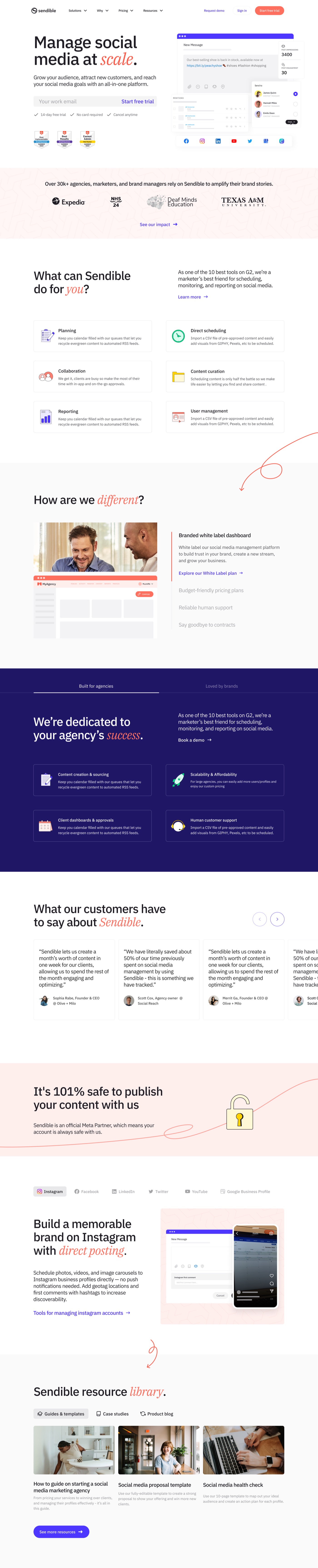
July 2024. The second rebuild, launched as an A/B test on 23 July. By 2 August it was clearly ahead and we stopped the test early and made it default. That’s the cleanest win on this page in four years, and it came from the one rebuild where we had a hypothesis before we had a design.
By October the effects had settled: bounce rate down 39%, page views up 26%, search impressions up 22%, and average keyword position improved from 66 to 62.

December 2024. The interactive demo came off the page. It was doing the thing that is easiest to mistake for success: people watched it, and then they did not start a trial. We pulled it and reworked the hero in the same change.
February 2025. Not a rebuild so much as a set of targeted changes. The interactive demo returned, this time mid-page. The hypothesis was specific: visitors were completing the demo and still not starting a trial, which suggested they lacked the context to make that decision rather than the interest. Higher up the page they had seen almost nothing about the product. Placed after the sections that explained it, the same module would reach people equipped to act on it.
March 2025. A networks and integrations module went in as the second section, directly after the hero. Visitors were evaluating us on whether we supported the platforms they actually posted to, and that answer sat too far down the page to reach them. This is the same module the 2026 audit later found was generating no clicks by design, which is its own lesson: answering a question is not the same as answering it in a form anyone can act on.

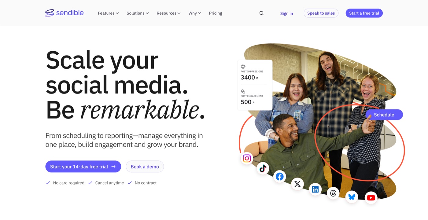
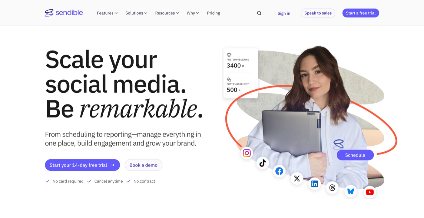
August 2025. The brand refresh had shipped, so the hero needed new imagery and copy to match it. Rather than treat that as a straight swap, we used it to test a question we’d never answered.
The new support team photo ran against an image of a single colleague. The hypothesis: a team shot would read as credible to agencies and decision makers, while one recognisable person would land better with freelancers and creators.
Engagement was near identical. Time on page was slightly longer on the team photo. Conversion showed no meaningful difference.
So the image wasn’t the variable. What decided it was that the business was moving upmarket toward multi-location customers, and the team photo suited that audience better. We kept it and turned to the homepage copy instead, because the test had shown the photograph wasn’t what was holding the page back.
February 2026 to July 2026. The last cycle, and the most systematic. Five publishes in eighteen days in February, then the audit that produced the diagnosis at the top of this case study, then the July restructure: six changes drawn from a 33-idea inventory, removing the interactive demo and the customer logo strip, relocating social proof above the fold, adding an objection-handling block, and rewriting the calls to action for lower commitment.
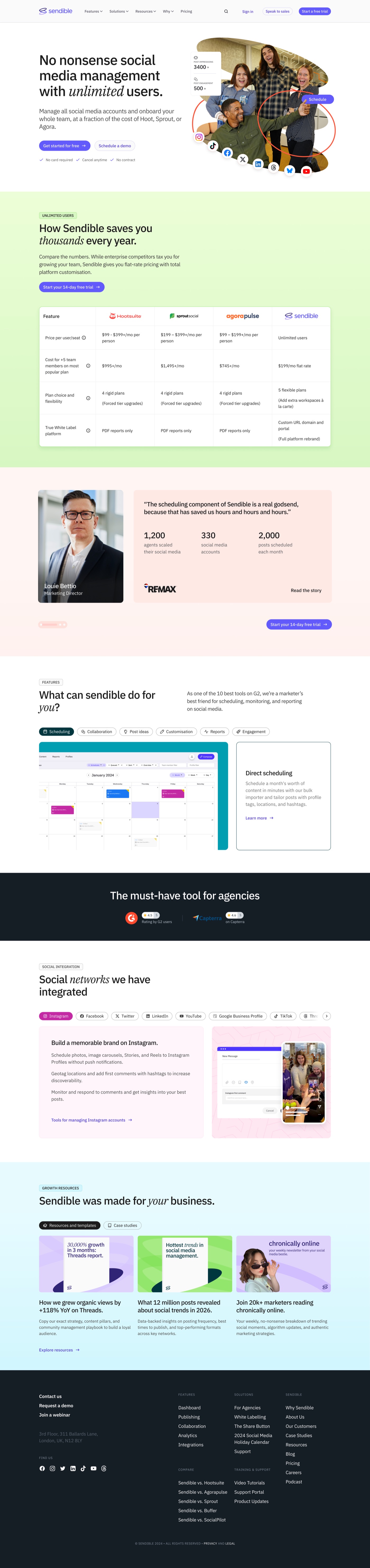
Four rebuilds, and the difference between the first and the last is not the design. It’s that by 2026 we knew which parts of the page were failing before we touched them.
The July test
We tested a hero variant leading on “unlimited users” against control, running 9 to 20 July 2026.
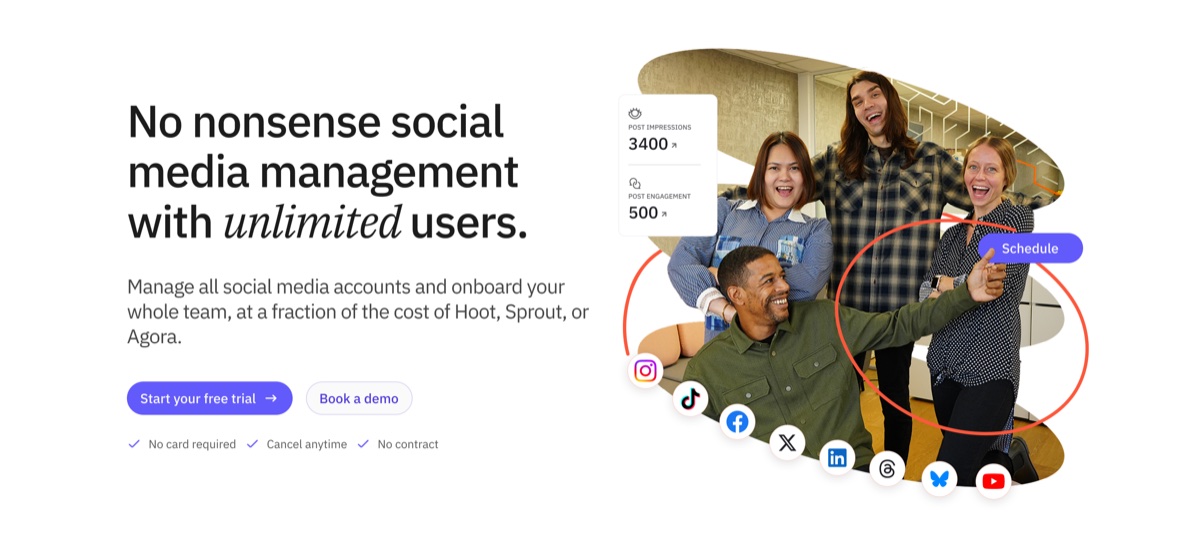
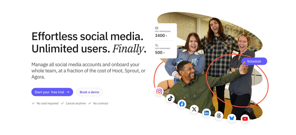
At day eleven I posted this to the team:
Across 8,300 views and 55 contacts, A is at 0.70% page-view-to-contact and B at 0.62%. Last week’s early lead for A has largely dissolved. Honest position: at this traffic level and effect size, this test is unlikely to reach statistical significance in any reasonable timeframe. So rather than waiting on the conversion rate alone, we’ll decide by the end of the week what the contacts are actually worth. A page that converts slightly less but brings in better-fit contacts is the one we want.
We then segmented contacts by the plan tier each visitor selected before signing up.
| Plan tier | Control (A) | A % | Variant (B) | B % |
|---|---|---|---|---|
| Elite | 2 | 4.3% | 0 | 0.0% |
| Premium | 2 | 4.3% | 2 | 5.4% |
| Plus | 28 | 59.6% | 24 | 64.9% |
| Core | 8 | 17.0% | 4 | 10.8% |
| No value | 7 | 14.9% | 7 | 18.9% |
| Total | 47 | 37 |
My closing note:
B did shift the mix the way we hoped, a higher share toward Plus, and entry-level Core signups cut roughly in half. That’s a real signal that the “Unlimited Users” message lands with multi-user teams. Two things went the other way. A captured 2 Elite-tier trials and B captured none, and at the top of our pricing a couple of accounts matter more than a percentage point of mix. A also brought in more contacts overall. B attracted a slightly better-shaped audience, but A attracted more of them, including the biggest ones.
We kept control.
The July test · contacts by plan tier
Variant B shifted the mix toward Plus
| Plan tier | Control (A) | A % | Variant (B) | B % |
|---|---|---|---|---|
| Elite | 2 | 4.3% | 0 | 0.0% |
| Premium | 2 | 4.3% | 2 | 5.4% |
| Plus | 28 | 59.6% | 24 | 64.9% |
| Core | 8 | 17.0% | 4 | 10.8% |
| No value | 7 | 14.9% | 7 | 18.9% |
The test didn’t produce a winner. It produced a better question: were we optimising for the number of trials, or the value of them?
Pricing
The pricing page takes over 130,000 visits a year and is the closest page to the money. It also bounced 79.8% of them.
It was rebuilt three times across four years, each for a different reason.
December 2022. Restructure of how plans were presented. Demos booked from the page doubled, from two a week to four, and roughly 27% of visitors who clicked a plan went on to sign up.
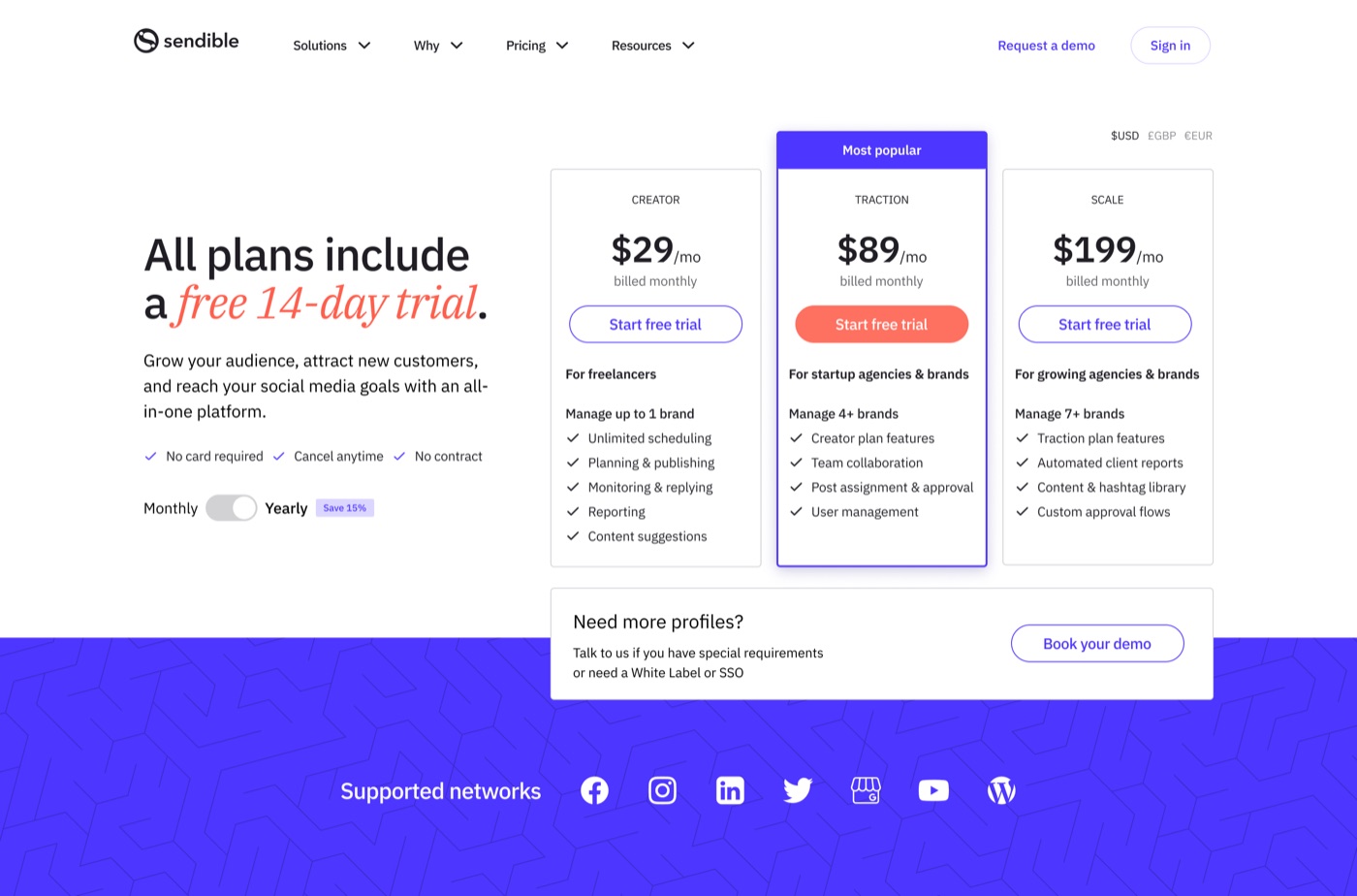
July 2024. A new pricing page. Scale-tier trials rose from 2 to 11, the first evidence that plan presentation was steering people between tiers rather than just toward or away from signing up. Total trials fell over the same period, from 488 to 313, so this was a shift in mix rather than a lift in volume.
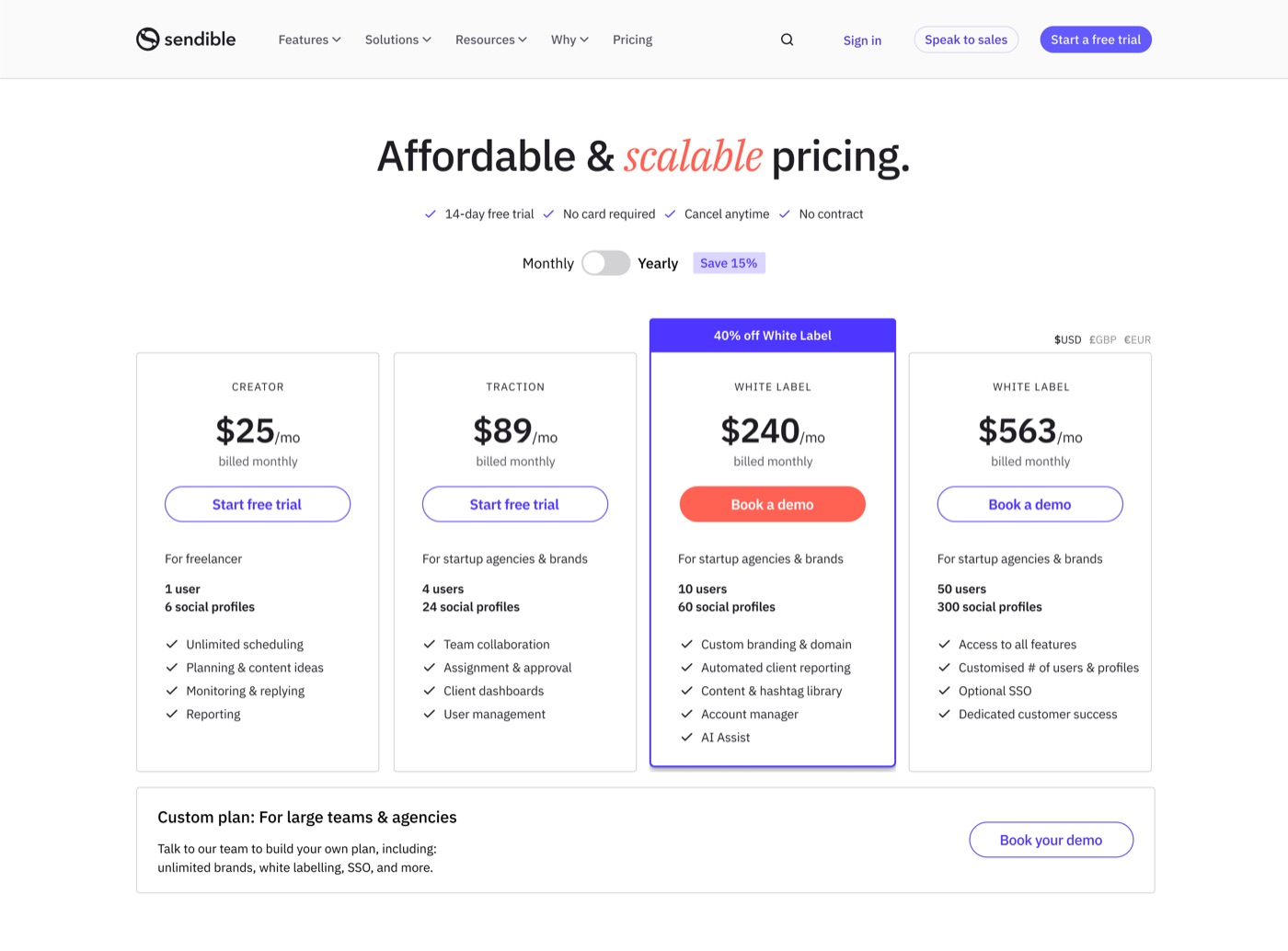
Q3 2025. Three changes to how plans were presented: an explicit saving on annual billing, a Most popular flag on the Scale plan, and a background change to raise contrast between the cards.
The hypothesis was that plan choice was a comparison task being made harder than it needed to be, and that clearer hierarchy would let people decide faster.
Trial conversion rose from 4% to 6%. Traction plan adoption rose from 20% to 31%.
That’s the clearest win on this page. It also reinforces the annual billing finding above: making the saving explicit moved people toward the plan that earns more per account.
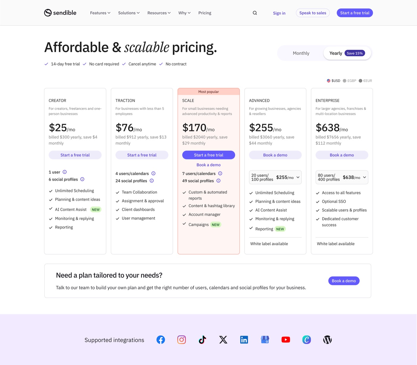
June 2026. The largest rebuild, published 24 June and timed to the launch of workspaces, which changed what customers were actually buying. Unlimited users moved to every plan, the tiers were renamed and restructured into five, monthly and annual toggles appeared on both the plan cards and the comparison table, and currency switching between dollars, pounds and euros was added to each.
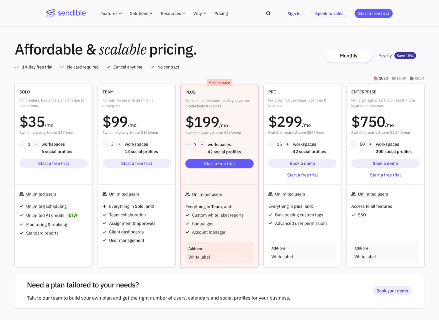
The 2026 rebuild had a second problem underneath the design one. Pricing content had become difficult to maintain: plan names, feature lists, tier limits and copy were scattered, and every change meant hunting through the page for every place a value appeared.
The prototype
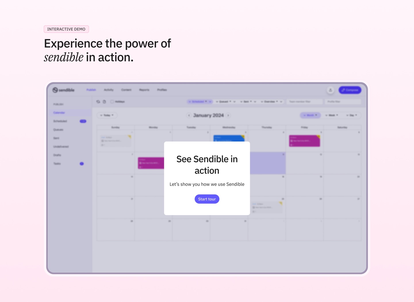
For the 2026 rebuild I stopped producing static screens and built the page in code with Claude Code.
Two things came out of that which a Figma file wouldn’t have delivered.
Delivery time collapsed. The usual cycle for a page of this complexity ran about two weeks, most of it spent in the gap between what a static design showed and what a developer needed to infer. Handing our external developers a working build instead of a file removed most of that interpretation. It shipped in about a week.
The reason is simple enough. A pricing page is mostly conditional behaviour. What happens to every price when the billing toggle flips, what changes when the currency switches, how the comparison table stays aligned with the cards, what the layout does when a plan is removed. None of that is legible in a static frame, and all of it is obvious in a working one.
I built the content manager too. Rather than describing how pricing content should be structured, I built the interface for managing it into the prototype, so the team could see the plan names, tier limits, feature lists and copy arranged as they should be, and see how editing one value propagated everywhere it appeared.
That turned a documentation problem into a demonstration. Nobody had to be persuaded that the content model was better, because they could use it.
The design decisions, the pricing architecture and the interface were mine. Claude Code was a fast pair of hands that let me deliver a specification people could operate rather than one they had to interpret.
The demo page
This is the one I got wrong, and then spent two years getting right.
It was never a conversion page
The demo page was introduced to raise the quality of demos reaching sales, not the quantity. It worked. Volume fell, value rose, exactly as intended. The internal brief was explicit: only high-value demos should book a call, ideally those on plans above $240, and everyone else should self-serve through video tutorials or the interactive demo.
It was a qualification gate.
So I tested it on the wrong metric
In mid-2024 I designed two replacements and tested them against the existing page.
| Visits | Demos booked | Conversion | |
|---|---|---|---|
| Control | 147 | 30 | 20.4% |
| Variant 1 | 155 | 21 | 13.5% |
| Variant 2 | 111 | 17 | 15.3% |
Both of mine lost and we reverted.
I recorded that at the time as a straightforward failure. It wasn’t. We measured demos booked on a page whose entire purpose was to book fewer, better demos. Nobody checked what happened to demo value, or to the self-serve traffic the page was supposed to be creating.
The lesson this case study keeps returning to had just happened to us, and we hadn’t noticed. I’d also redesigned the page because it looked dated, not because evidence said it converted badly, which is why I had no hypothesis for why control was winning.
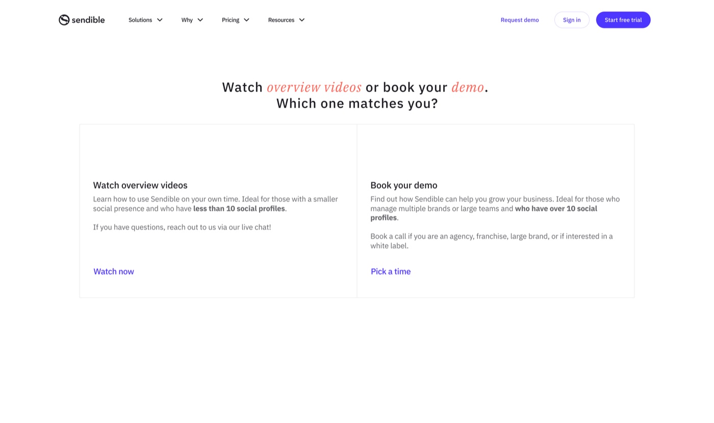
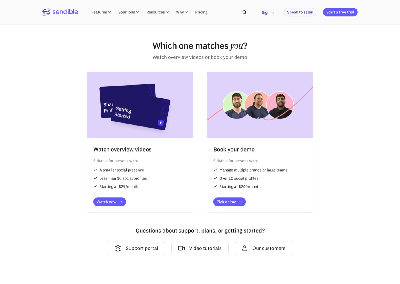
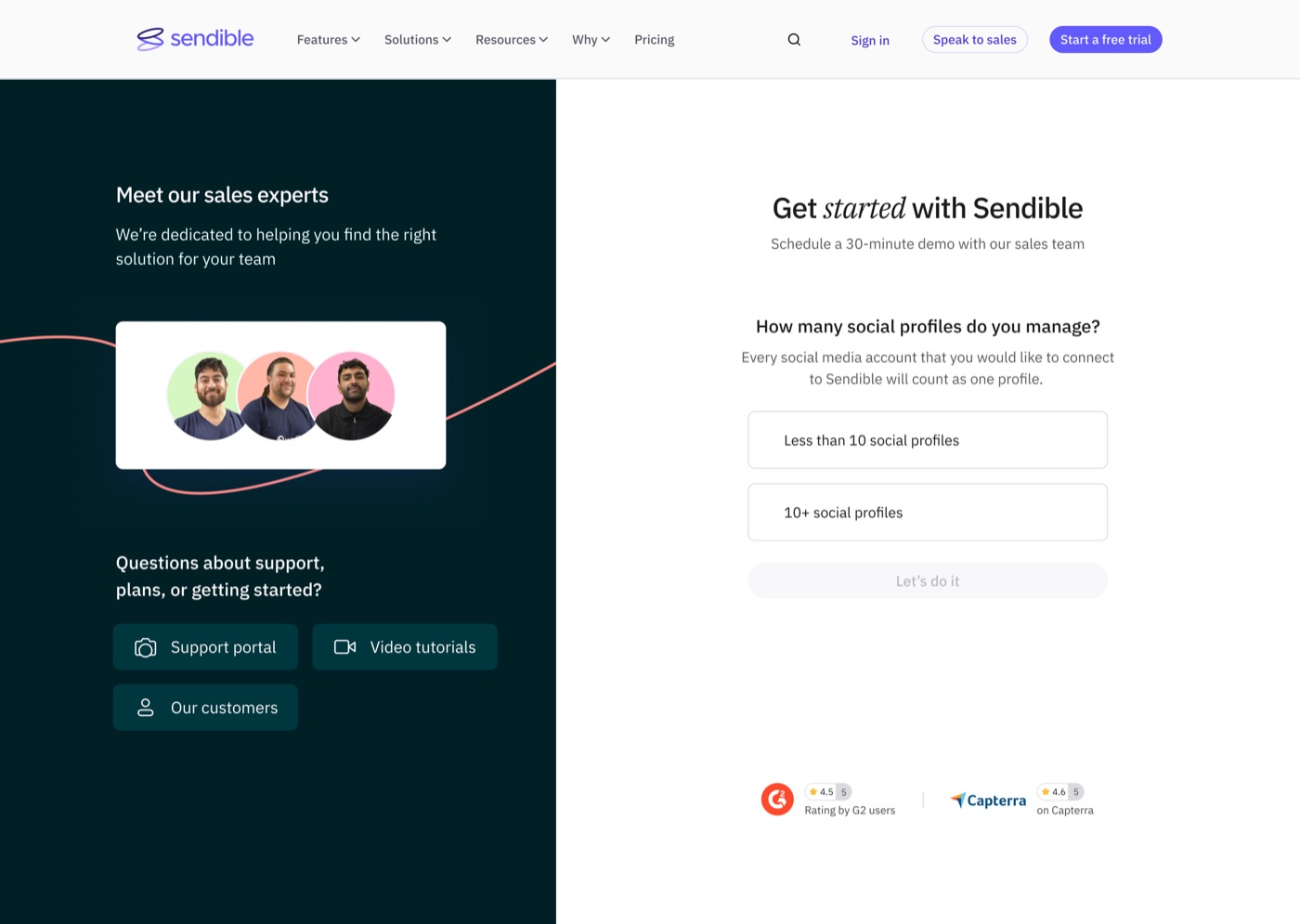
Then we rebuilt it as a routing problem
Four updates, each solving a different failure in how people chose their path.
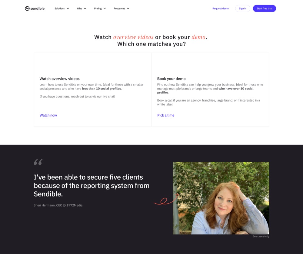
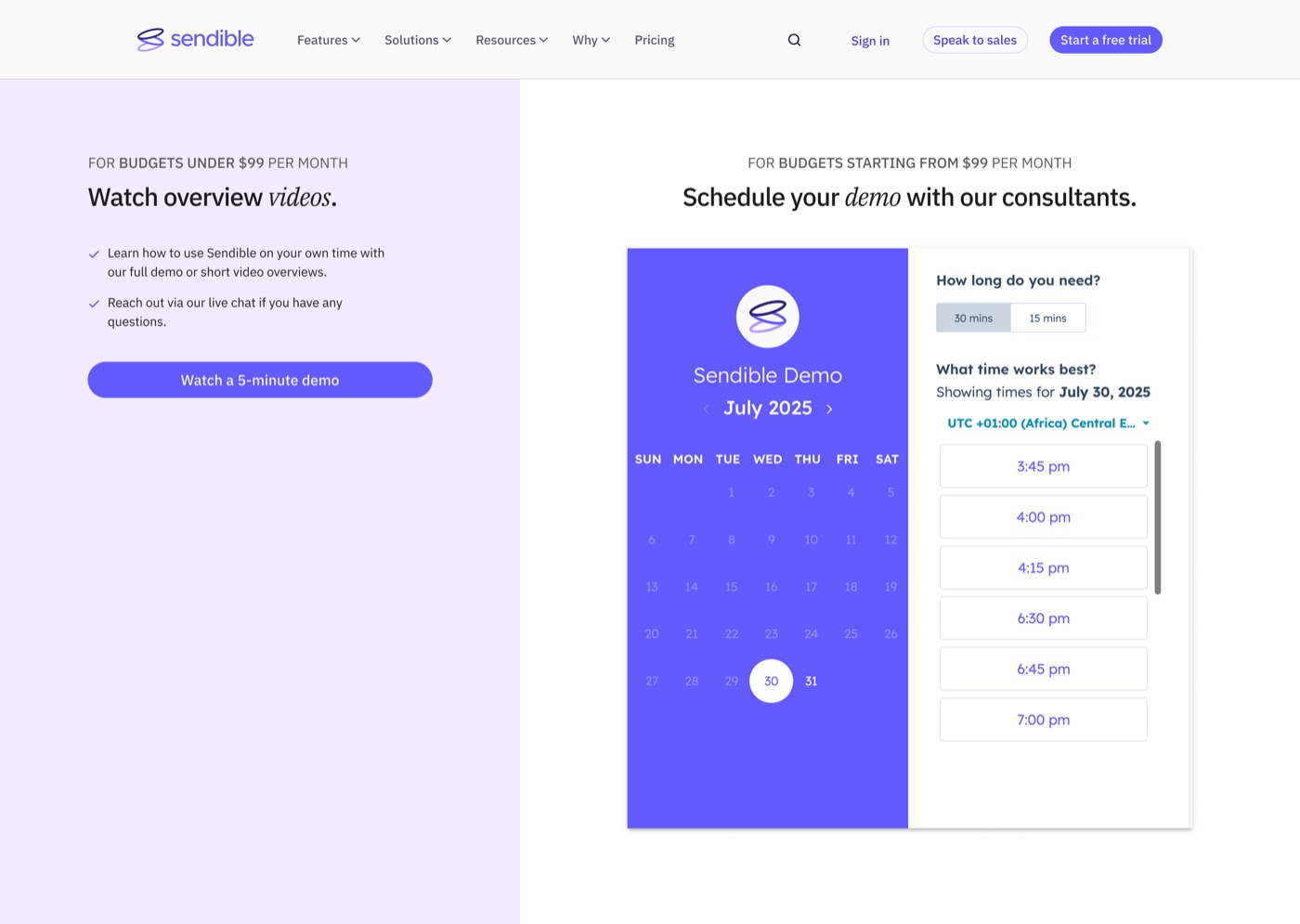
Q1 2025. Make the two paths explicit. The page split into budget bands: under $99 a month to overview videos, from $99 a month to a consultant booking.
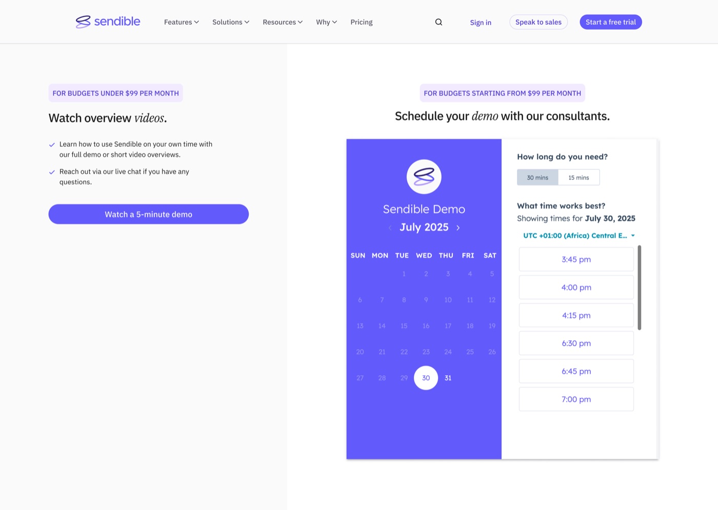
Q3 2025. Make them legible. Colour, spacing and hierarchy reworked so a visitor could see both routes and tell which was theirs without reading closely. Same content, faster comprehension.
Q1 2026. Fix the language. Three changes, run as a test against the existing page.
The main call to action read “Watch a 5-minute demo”, which set the wrong expectation, since the destination offered several ways to explore rather than one video. It became “Explore the platform.”
The path labels were sorted by price. “For budgets under $99 per month” became “For creators and freelancers”, and “for budgets from $99” became “for teams, agencies and multi-location businesses.” Same routing logic, but it now describes who someone is rather than what they can afford. People self-identify readily by role and reluctantly by budget.
And G2 badges were added beside the booking calendar, where hesitation happens.
The test came back inconclusive. Equal performance between control and variant, and not enough traffic to separate them in the time we ran it. We kept the changes on the reasoning rather than the result: the labels were more accurate, and accuracy isn’t something a flat test disproves.
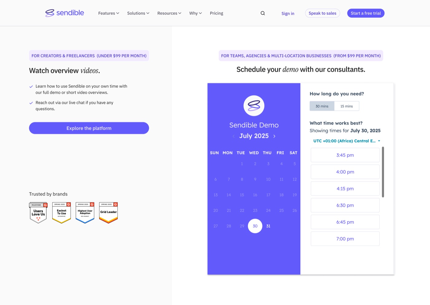
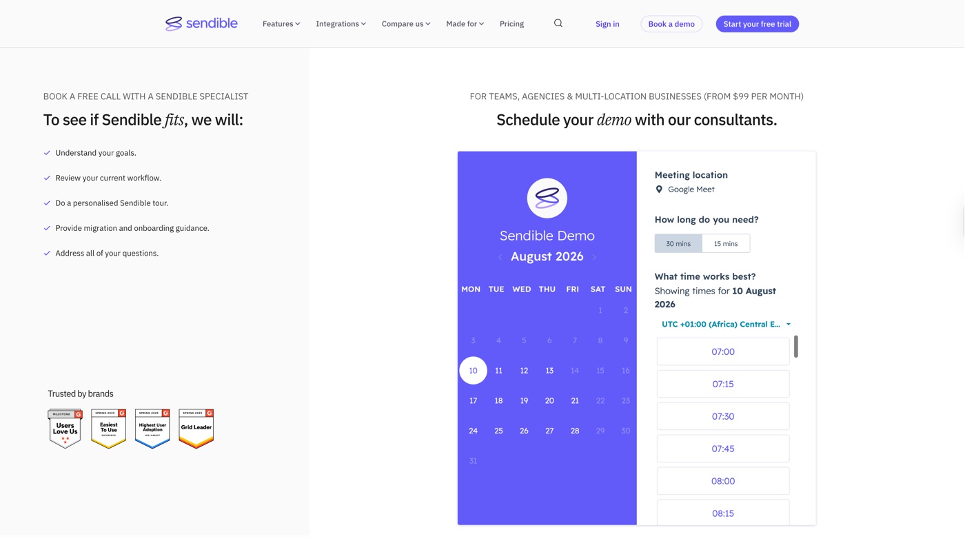
Q3 2026, live 17 July. Stop offering an exit. The left column had spent two years pointing people toward overview videos, which meant the page offered an alternative to booking before anyone had booked. It was rewritten to set out what actually happens on the call: understanding your goals, reviewing your current workflow, a personalised tour, migration and onboarding guidance, and answers to your questions.
Same page, same layout. It now argues for the booking instead of offering a way around it.
The result
The change went live on 17 July 2026, when demo pipeline was the weakest it had been all year.
Within the first week of August, demo pipeline had already passed the whole of July. By the 18th it stood at $7.4K, 66% above July’s $4.45K, with nearly two weeks of the month still to run.
Demo pipeline · July → August 2026
August passed July with the month still running
July was the weakest month of the year, so part of the gain is recovery rather than pure improvement, but August cleared the whole of July inside its first week and has kept climbing.
July was an unusually poor month against a 2026 average roughly two and a half times higher, so part of that gain is recovery rather than pure improvement. But it’s no longer a single-week reading: the lift has held for a month and is still climbing.
What I’d take from the whole sequence is simpler. The 2024 test failed because we measured the page against a goal it didn’t have. Every improvement that followed worked because we stopped asking how to get more demos and started asking how to help people find the right path.
The plan page
The one where I built something, tested it for a year, and found out the problem it solved wasn’t the problem we had.
The defect
Every free trial call to action on the site dropped people onto the lowest plan by default. Homepage, navigation, banners, everywhere except pricing.
So a marketing director at a fifty-person agency and a freelancer starting out began the same trial, on the same tier, having seen none of the plans above it.
Pricing was the only page that carried plan context through to sign-up. Everywhere else, the choice was made for you and you weren’t told.
Trial routing · through 2024
Every trial CTA landed on the same tier
Four of every five entry points dropped the visitor onto the lowest tier, having seen none of the plans above it. Pricing was the only route that carried the choice through.
The fix
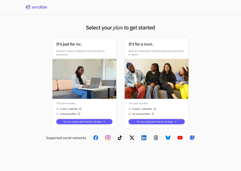
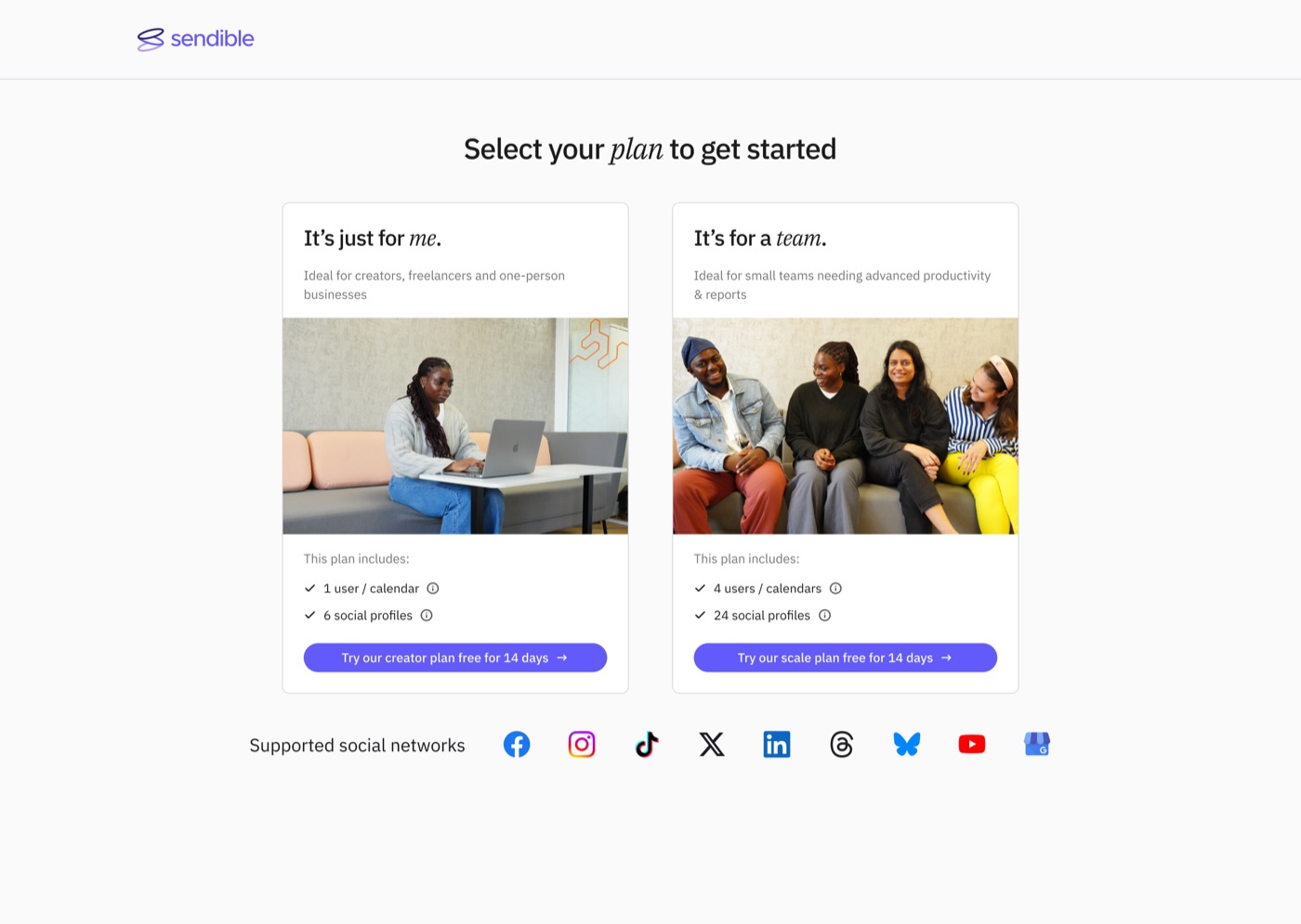
In late 2024 I built a plan selection page between the trial CTA and the sign-up form. One step, two options, so a high-value buyer would at least see a higher tier before committing to the lowest one.
What the data said
By 16 December our head of marketing had a heatmap read. Most visitors were clicking the entry-level plan anyway. He’d already swapped which tier carried the “team’s choice” label, from Scale to Traction, and the pattern held.
“It’s a shame to see that, but it potentially underlies most are solo users.”
70% were registering for the entry-level trial.
Worse, since introducing the page, both volume and conversion had fallen. An extra step in a flow will do that, and we hadn’t yet separated how much was the step itself and how much was the audience.
Testing it properly
Four things went into 2025, all aimed at the same target: nudge trialists toward higher-value plans.
Images against icons on the plan cards. A mobile layout putting both plans above the fold. Bluesky and Threads added to the network logos. CTA copy testing.
The image test is the one worth reporting, because it reversed. Early on, the version without images was ahead. After a few months, the version with images was clearly performing better.
That’s a small lesson with a wide application. We would have called it for the icons version if we’d read it at two weeks, and we’d have been wrong.
The premise was wrong
None of it moved the number that mattered. People kept choosing the lower plan.
Which forced a more uncomfortable question than the one we’d started with. We had assumed high-value buyers were being mis-routed. The data suggested something simpler: the people arriving through a free trial CTA were mostly lower-value buyers to begin with. The page wasn’t failing to inform them. It was informing them correctly, and they were choosing accurately.
So the page was solving a problem that existed mainly in our assumptions, while adding a real step to a flow that measurably didn’t want one.
Removing it
By 2026 three things had converged. The testing had shown the page wasn’t moving anyone toward higher plans. The workspaces launch changed what customers were choosing between, which made a two-option page a poor fit for the new structure. And the sign-up panel could carry plan context directly, without a separate step.
So it came out.
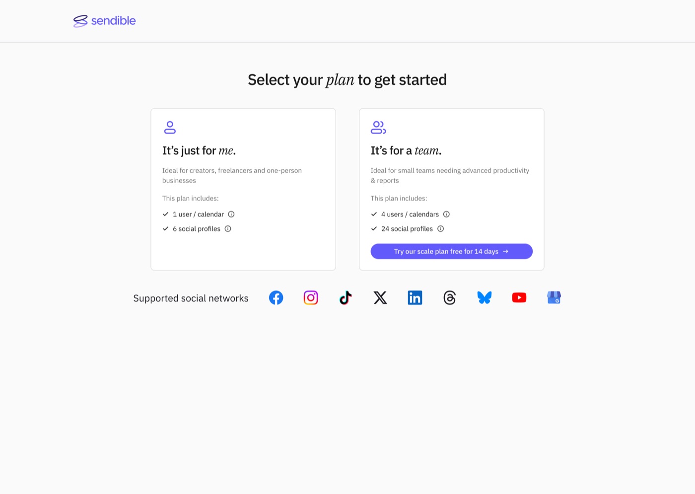
Its one useful function, carrying plan context into sign-up, never needed a page of its own. It needed the sign-up page to know what had already been chosen. That’s the panel that launched on 4 August, and it’s why the section below ends the way it does.
Sign-up flow · 2026
Four steps became three
Before · four steps
After · three steps
The plan page's one useful job, carrying the chosen plan into sign-up, moved into the sign-up panel itself, so the separate step wasn't needed.
I built the page, and I ran the testing that showed it wasn’t doing its job. Both of those are the work. The decision to remove it was the team’s, and by the time we made it the evidence had been sitting there for a year.
Sign-up
Both optimised entry points, homepage and pricing, funnel into the same page.
In 2024 it converted 44.80% of the people who reached it, against a target of 50%. By 2026 that had fallen to 20.46%, from 6,902 clicks through to the page.
The 2024 pattern was already the awkward kind: visits at an all-time high while conversion steadily declined. More people arriving, fewer finishing. Traffic growth was masking a page getting worse at its job, and over the following two years it got worse faster.
Sign-up · 2024 → 2026
Visits rose while conversion fell
Conversion is measured: 44.80% in 2024, 20.46% in 2026, when 6,902 people reached the page. The visits line shows the trend to an all-time high over the same window.
What the heatmap showed
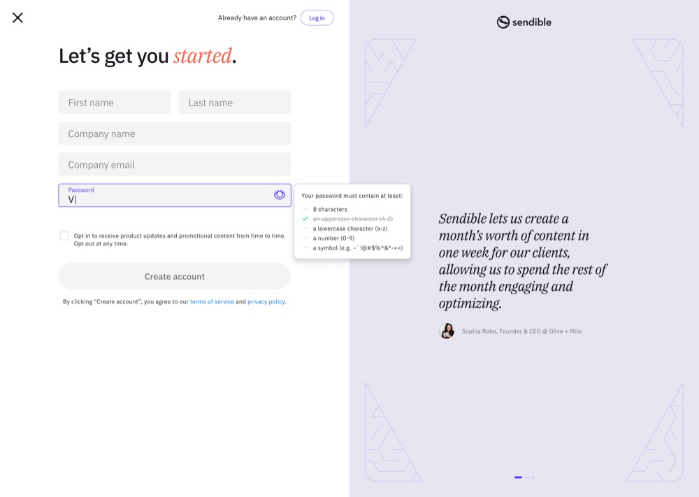
Most activity clustered exactly where you’d expect, on the form fields themselves, which meant friction there was landing directly on conversion. Password requirements and field layout were doing more damage than their size suggests.
Then three things competing with the one action the page existed for.
A close button in the top left, offering an exit before anyone had started.
The log-in link, sitting above the primary button on a page built for new customers, though removing it wasn’t an option, since some existing customers rely on it to get into the app.
The social proof column on the right, meant to build confidence, drawing almost no interaction at all.
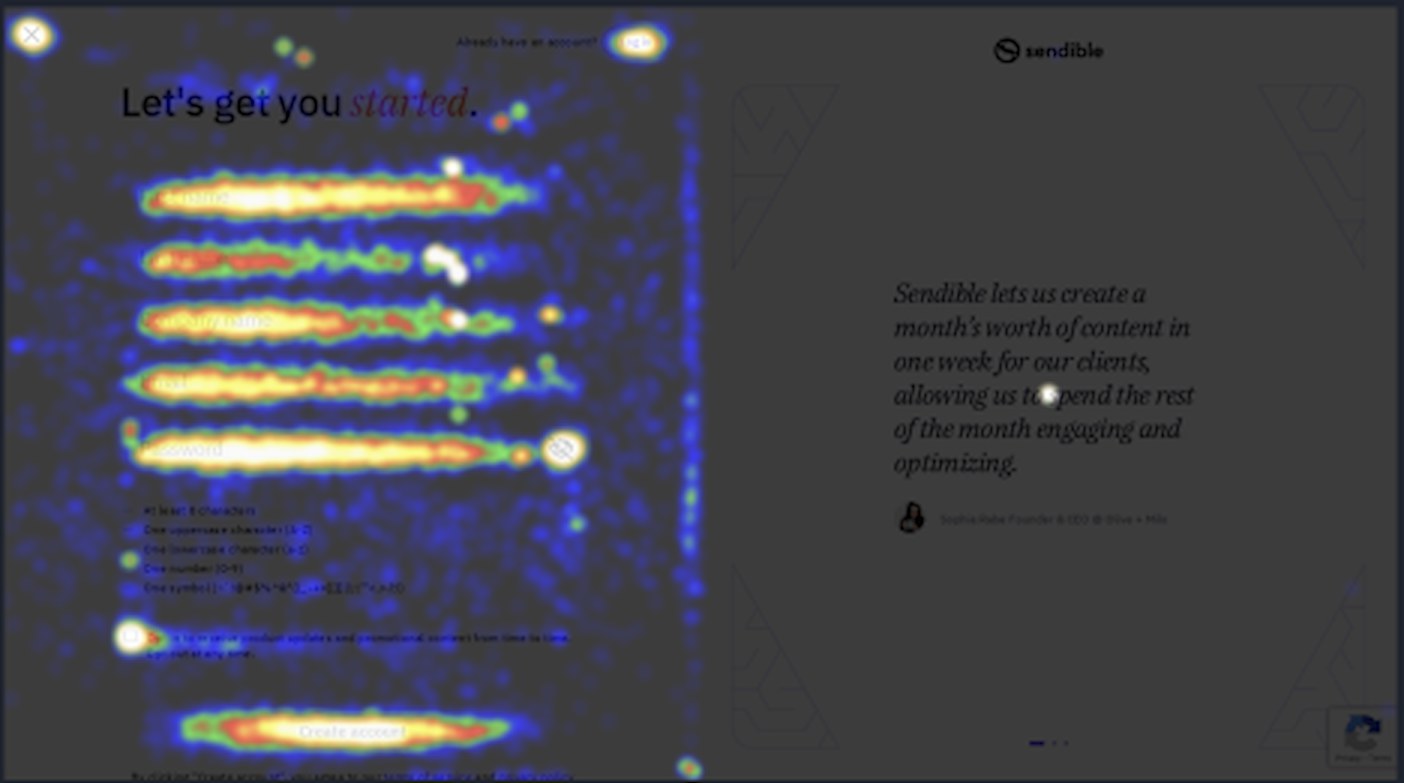
1 Close button, top left
An exit offered before anyone had started.
2 The log-in link, above the primary button
Prominent on a page built for new customers.
3 The social proof column
Meant to build confidence, it drew almost no interaction.
Prioritising
Eight recommendations, scored on impact against effort.
| Recommendation | Impact | Effort |
|---|---|---|
| Move the CTA above the fold | High | Low |
| Improve contrast and size of the primary button | High | Low |
| Remove the close button | Medium | Low |
| Add a phone field and a company email hint | Medium | Low |
| Move the log-in link below the primary button | Medium | Medium |
| Replace social proof with a plan-aware panel | High | High |
| Breadcrumb showing the selected plan | Medium | High |
| Simplify password requirements, shown in a pop-out | High | High |
Sign-up · impact against effort
Eight fixes, scored, two to do first
Worth noting where my own preferred idea landed. Showing the selected plan scored medium impact, high effort, and I wrote against it in the rationale: it guides people through the process but risks pulling attention from the primary action. I liked the idea. The scoring didn’t, and the scoring was the point of having it.
What shipped in 2024
Password requirements simplified, since the heatmap put more hesitation around that field than any other.
First and last name moved onto one line. A small change that shortens the form visually without removing anything from it. Perceived length matters more than actual length on a form people are deciding whether to bother with.
The close button removed. No reason for an exit control on a page whose only job is completion.
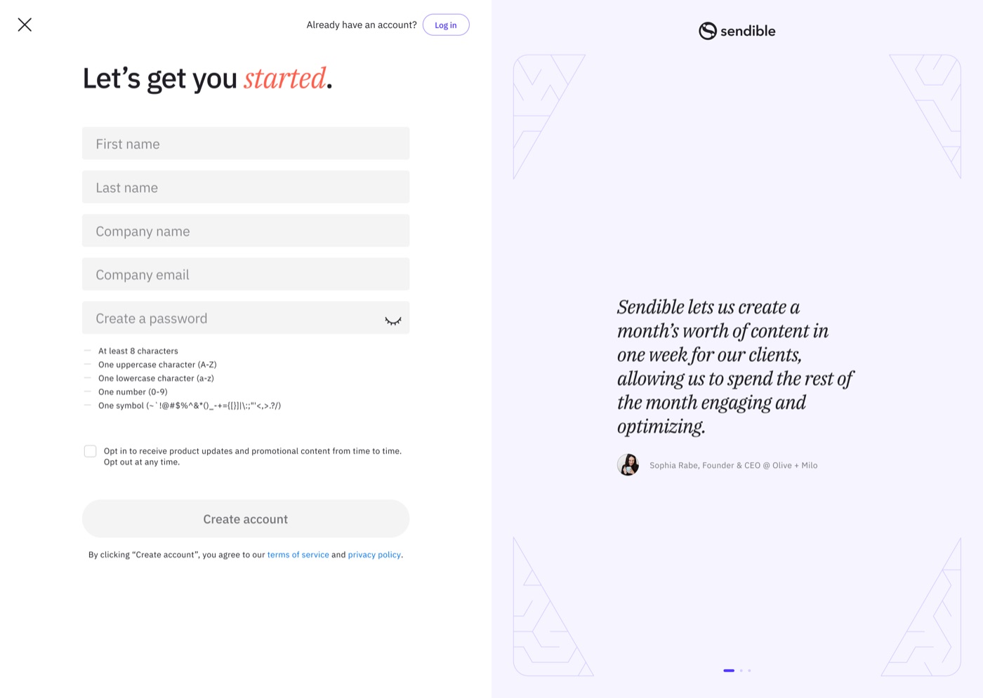
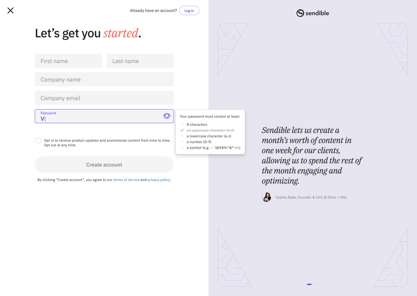
We kept the log-in link, against the recommendation. Sending existing customers hunting for it to protect a conversion metric would have been optimising the number rather than the experience. Reducing its prominence was enough.
The one we couldn’t do
The plan-aware panel needed the sign-up page to know which plan a visitor had selected on pricing. Our CMS’s dynamic content couldn’t execute inside the iframe the page ran in, and the page belonged to product rather than marketing, so the fix needed time from a team with its own roadmap.
It sat unbuilt while the social proof column carried on occupying the right-hand side of the page and earning almost none of the attention it was placed there to capture.
The sign-up funnel
Two entry points, one page, two owners
Homepage and pricing were marketing's to optimise, but both converged on a sign-up page that belonged to product. The blocker was never the design; it was the boundary.
And then we did
The answer was to stop trying to reach into the iframe and control it from outside instead.
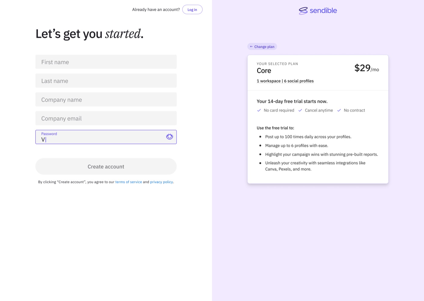
Rather than injecting content, the page renders from query parameters: plan, region, and billing frequency passed in the URL, defaulting to Plus if nothing is specified. And rather than building anything new, we duplicated the existing pricing page module and reskinned it, so the plan display was a component product already ran rather than a component product had to accept.
That changed the ask entirely. Not “rebuild a page you own,” but “change what loads in a frame you already have.” The same request, made buildable.
The panel went live on 4 August 2026, into the exact space the heatmap had flagged as dead two years earlier. The “Go Back” control became “Change plan” and now returns people to pricing rather than nowhere in particular.
Sign-up to trial conversion is running at 61.80%, against a July average of 27.6%.
More than double, on the page that had been quietly declining for two years. The metric is specific to the page that changed, which makes attribution cleaner than a site-wide number, though it’s still early data.
The heatmap found a column doing nothing. The journey data explained why: people arriving from pricing had already chosen, and were being shown general reassurance instead of confirmation of the specific decision they’d just made. Replacing one with the other took two years.
What took two years wasn’t the design. It was getting the constraint out of the way.
What I’d do differently is the route rather than the work. I built the case as a design argument and took it to the team that already agreed with me. What it needed was a shared conversion metric between marketing and product, agreed before the analysis started rather than discovered after it.
What I'd carry forward
Across all four pages, the constraint was never design.
At 25,000 to 30,000 monthly homepage views and sub-1% conversion, most tests here cannot reach significance in a sensible window. The answer isn’t more tests. It’s fewer, bigger swings, judged on contact quality rather than rate, with plan-tier segmentation built into the analysis from the start rather than reached for when the headline number disappoints.
The other thing is slower to fix and matters more. Three of the four highest-value sign-up changes were an afternoon of work sitting behind a two-year ownership question, and the demo page spent two years being measured against a goal it didn’t have. Both were failures of agreement rather than execution. The most useful thing I could have done earlier, in both cases, was get the teams that shared a funnel to share a definition of success for it.