
Reporting 2.0 · Sendible · 2026
The report that couldn't explain itself
A two-minute walkthrough of the rebuild, one beat at a time.
←→ arrow keys, tap, or swipe to move
It started with a note. Four years later I was asked to answer it.
I'd prefer to stay with Sendible, the price is perfect and the interface is easier to manage. But I haven't felt much confidence in the reports lately.
An agency customer, 2022
Reporting had grown into two systems that didn't know about each other.
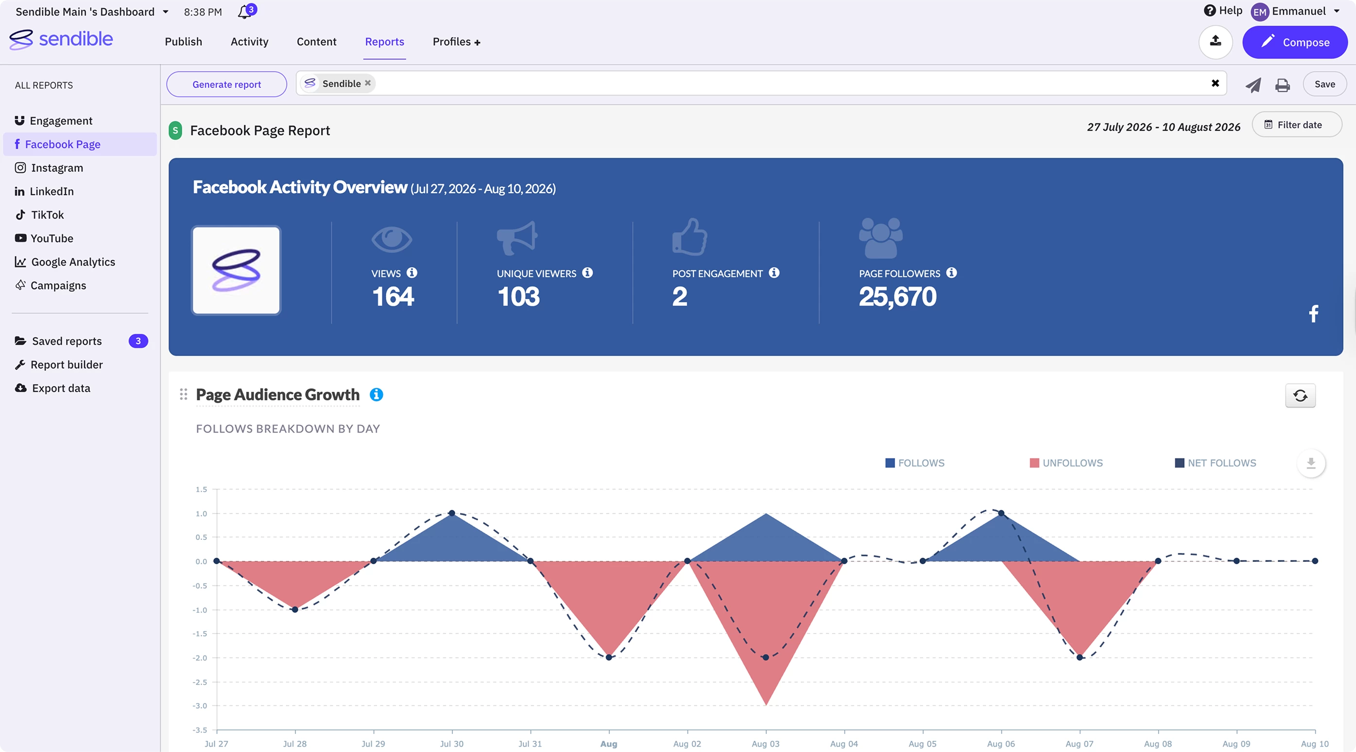 1 Seven networks, seven separate reports. No way to combine them.
 You could rearrange what you were given. You couldn't change it.
1 Seven networks, seven separate reports. No way to combine them. 2 Reorder the modules, yes. Add, remove or redraw one, no. And nothing on the screen belonged to the report.
1 Seven networks, seven separate reports. No way to combine them. 2 Reorder the modules, yes. Add, remove or redraw one, no. 3 Five palettes on one screen, none of them the report's own. The seams showed up as small bugs customers read as lies.
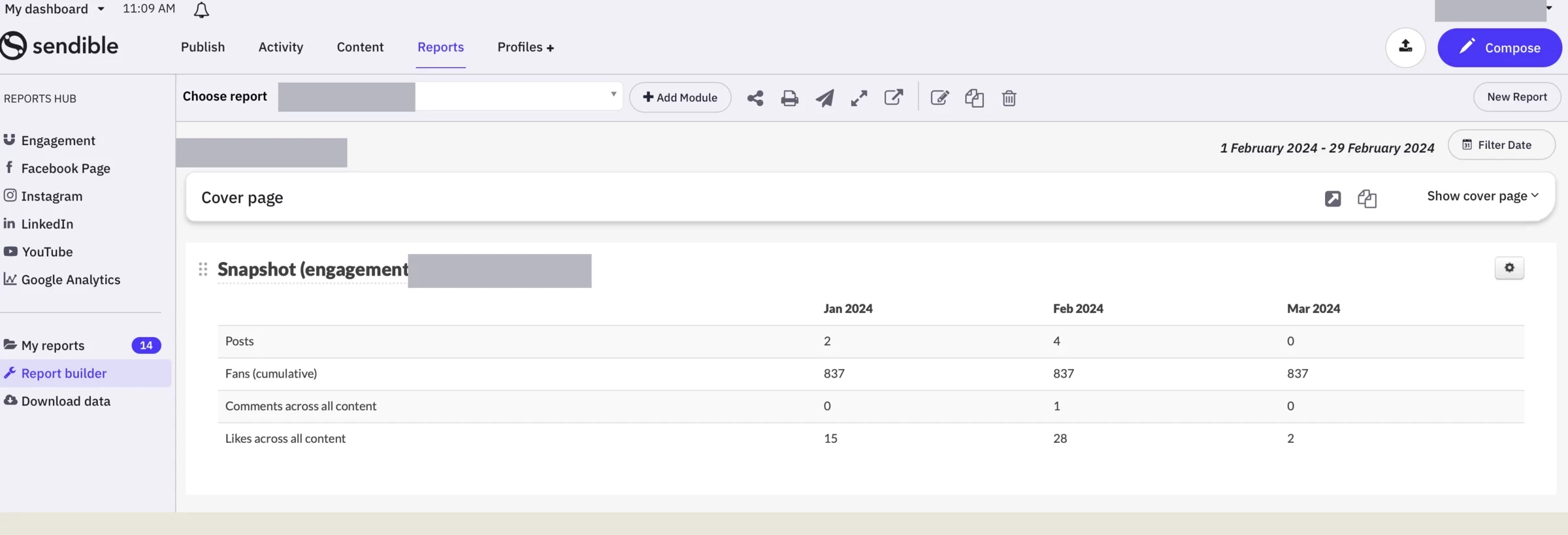
So before proposing anything, I sat with the three teams who absorb it, then read the tickets myself.
- Customer success
- Onboarding
- Support
Accounting firm · NPS 0 Reporting just isn't what is needed to manage anything at scale.
Agency, legal sector Despite the date filter set to Feb 1st to 29th, the widget is still showing 4th Jan to 1st Feb.
Marketing agency September saw higher engagement than August, but the percentage shows a decrease.
Nonprofit I need January to December. Engagement doesn't give me all the information.
Media monitoring, APAC Why are YouTube and TikTok not included in the engagement report? It only shows Facebook, Instagram and LinkedIn.
Influencer agency Modules always get added to the top, and dragging them to the bottom is tedious.
The central decision: stop treating quick and custom reports as different things.
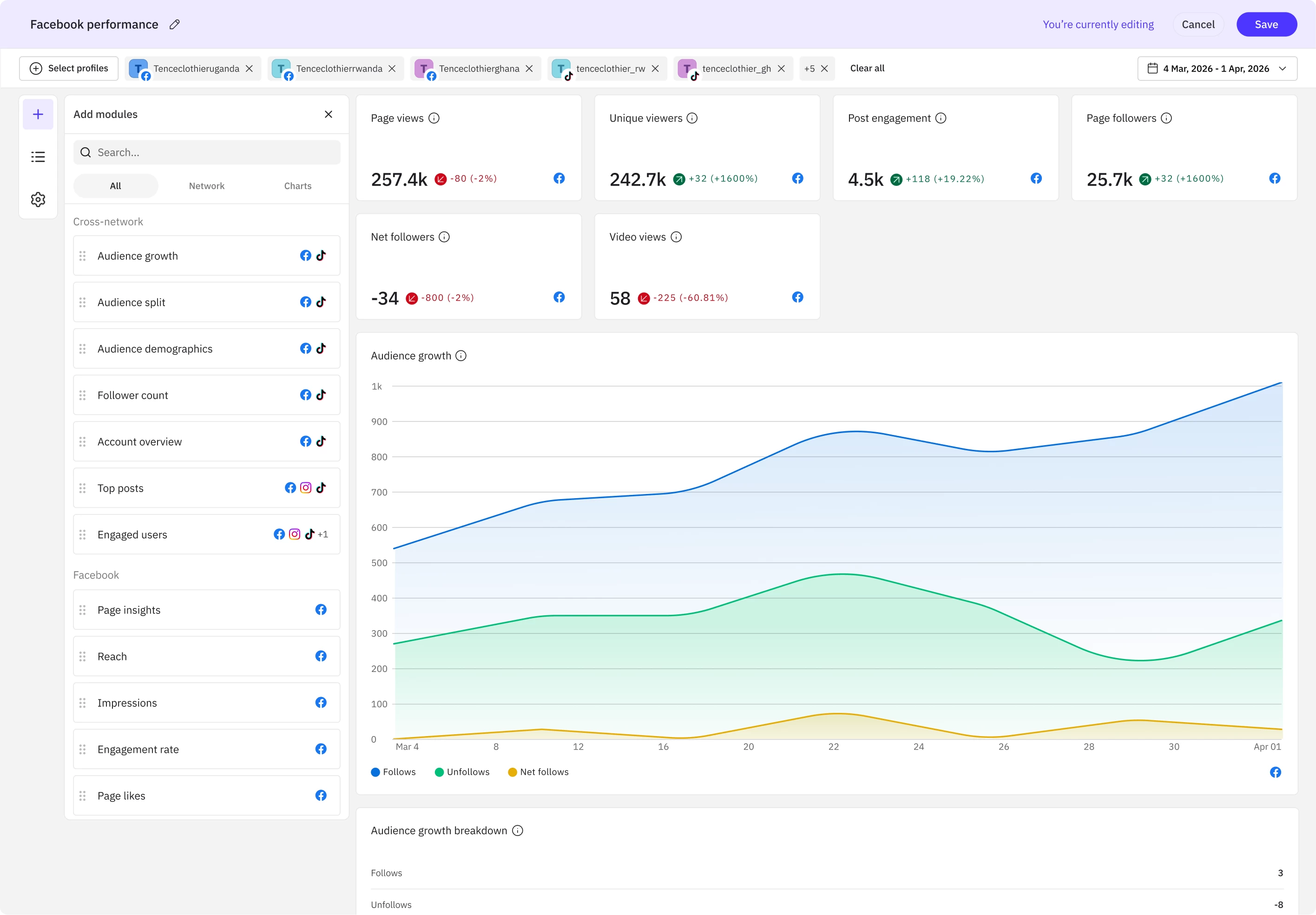
The real work was designing for the moment a report has nothing to say.
No data for this period
Try a different date range to see results.
No compatible profiles selected
This module needs a Facebook profile. Add one to see data here.
Loading data
This can take a moment for reports with many profiles.
No profiles selected
Modules will populate once you select profiles to report on.
Loading your report
This can take a moment for reports with many profiles.
Two rules came out of it, and they look like opposites. First: never hide capability, name the barrier.
 WL A
WL A 
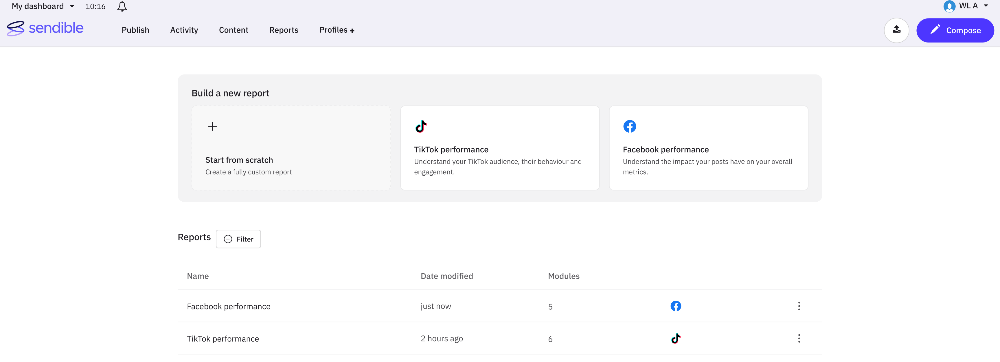
Build a new report
Cross-platform summary
Compare performance across connected channels
Facebook performance
Understand the impact your posts have on your overall metrics.
Recent reports
Second: show only what the decision needs. The template cards briefly carried a module count. I liked it. I took it out.
Iterations
The first version went for presence: cards running edge to edge, wider than the container they sat in, with the rest a page-arrow away. Bold, but it left half the templates off-screen.
The reports list shipped smaller than it started, by reusing a list component the product already had.
It began as a table with its own furniture: filter tabs, a search field, a grid-and-list toggle, and a bordered card, all built for this one page.
Telling someone whether they were viewing or editing took nine iterations. The fix wasn't a louder notice, it was almost none.
A line of text in the header naming the current mode, with an Edit link beside it. Follow the cue: Edit → Save → Exit.
And view mode was never a separate screen. It's the same report with about a dozen things switched off.






The first release shipped two networks, and looked finished doing it.
No launch metric. Instead, a precise picture of what it was costing.
The state model is what I'd carry forward. What a report says when it has nothing to say won't change.