
Web & content design · Sendible · 2024–2025 · 9 min read
Making a blog worth coming back to
We were winning new readers and losing them. The blog didn't need more content, it needed to be legible.
- 0.53%
- blog conversion rate, up from 0.37%
- +110%
- page views
- 7
- problems fixed with one colour system
What I did
- Co-ran a page-by-page audit of the blog against four competitors with our head of content marketing, and wrote down seven compounding problems
- Built a colour system where every topic cluster gets its own colour doing navigational work rather than decoration, and templated the feature images by cluster so they could be produced quickly and correctly by anyone
- Gave the blog its own navigation, separate from the site’s, with three ways into the same library, platform, job, or sector
- Rebuilt the article template against a defined structure, with sharing triggered by selecting any passage mid-read
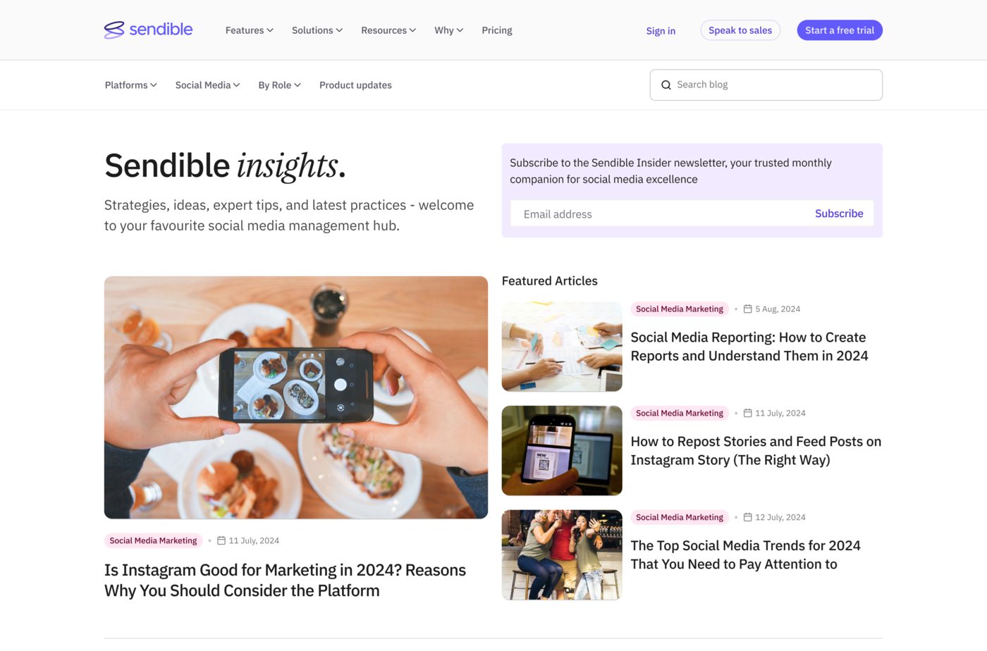
- Redesigned the front page as an entry hall, lead capture at the top and a tag-matched lead block
- Wrote the developer brief and ran it through our external development partner
The problem
The blog was working. That was the difficulty.
Traffic was healthy, rankings held, new visitors arrived in numbers nobody was unhappy with. The brief put it precisely:
“While our blog is performing well and we internally know what it does, this is not clear to new visitors. We’re happy with all the new visitors we’re getting, but we’d like them to stick around and come back as returning visitors who’ll eventually convert, the faster, the better.”
So the job wasn’t attracting readers. It was that a first-time reader had no way of understanding what they’d landed in, no reason to look at a second article, and no path from reading to anything else.
We had a library. It didn’t look like one.
The audit
Our head of content marketing noticed it first. She lived in the numbers daily and could see readers arriving and not coming back, without a clear account of why.
So we ran a session to work it out properly, went through the blog page by page against four competitors, and wrote down what we found. Seven problems, and they compound.
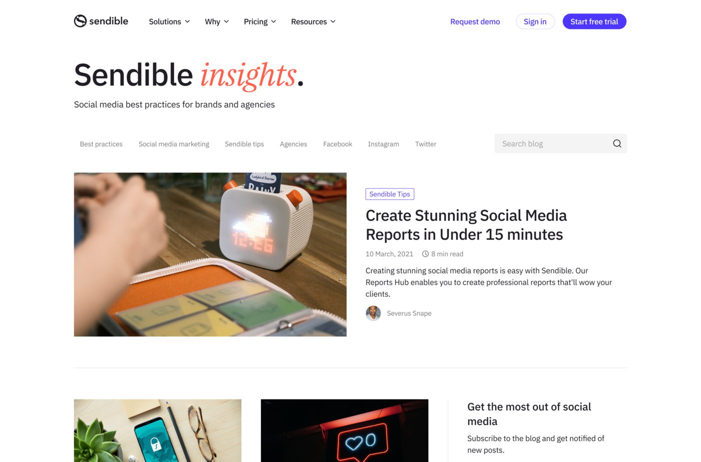
It wasn’t branded as anything. The tagline read “Social media best practices for brands and agencies” accurate, and true of every competitor’s blog. Nothing told a new reader they’d arrived somewhere specific.
The front page had no shape. Grey tags along the top, then the latest posts in a list. A reader who didn’t immediately see what they came for left, and there was no visible route to our resources, which mattered, because the blog is a top-of-funnel surface whose natural next step is becoming a lead.
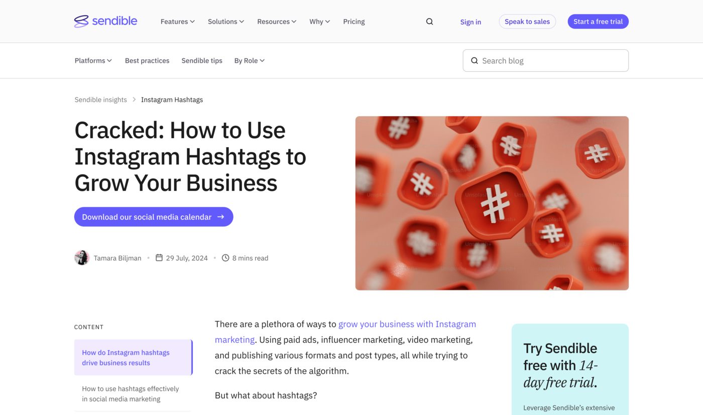
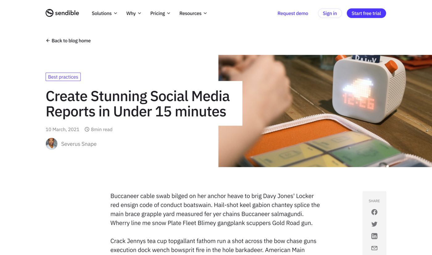
It looked like a different company. The homepage, feature pages and demo page had all been refreshed. The blog hadn’t. Feature images were sourced rather than designed, often unrelated to the topic, and never branded.
Tags were broken in both directions. One tag showed above each title with no control over which, the CMS picked by tag strength, which also determined the related-articles list underneath. So the weakest part of the system was quietly deciding what readers saw next.
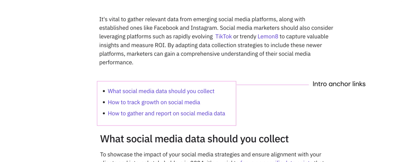
Long articles had no map. Navigation was a list of anchor-linked headings in the intro. Nothing to move with once you were inside a two-thousand-word piece.
Text ran in unbroken slabs. Very few ways to break content without importing media, on pages read mostly on phones.
Nothing was quotable. No way to select a passage and share it, the mechanism competitors were using to turn readers into distribution.

Colour system
The idea that tied the rest together.
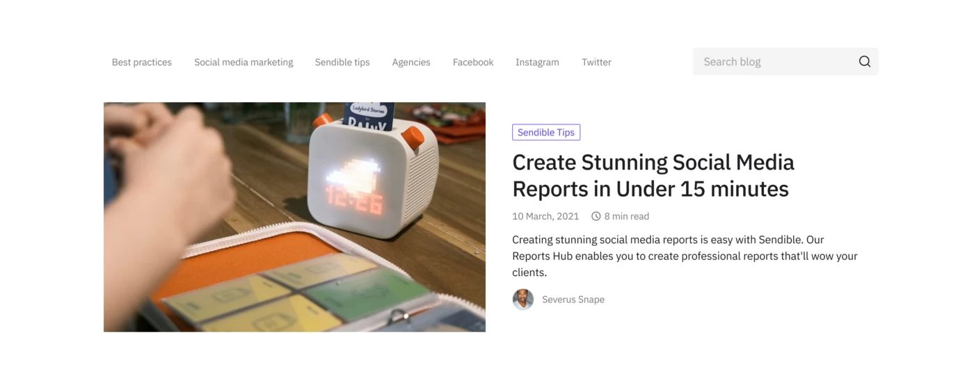
Every topic cluster got its own colour. Not decoration, structure. The colour appears in the feature image, behind the table of contents, behind the blockquotes, behind in-article images. An article about analytics looks like the other analytics articles, and looks unlike the scheduling ones.
That does three jobs at once. A returning reader recognises the territory before reading a word. Related articles become visually obvious rather than depending on a tagging system we already knew was unreliable. And it solved a production problem, feature images had been hard to source and inconsistent, so making them templated by cluster meant they could be produced quickly and correctly by anyone.
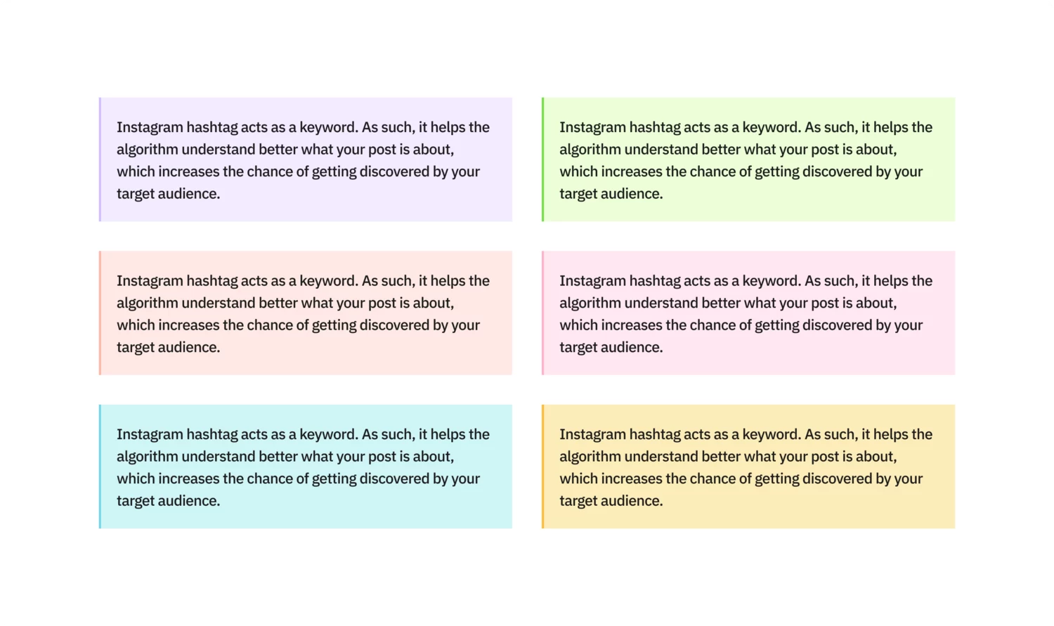
A visual language doing navigational work is worth more than a visual language doing decorative work, and it costs the same to build.
Topic navigation
The blog got its own navigation, separate from the site’s.
That was the decision underneath it. The site navigation is organised around the product: features, solutions, pricing. A content library isn’t organised that way. Someone arriving from search for a post about Instagram Stories doesn’t want to know what plans cost. They want the other posts about Instagram.
So the blog carries a sticky menu of its own, structured in three groups:
- Platforms: Instagram, TikTok, X, LinkedIn, Facebook, Bluesky, Threads, YouTube
- Social media management: publishing, planning, reporting, content management, community management, content creation, video marketing, holiday marketing
- By industry: agencies, real estate, hotels, healthcare, insurance, fitness and wellness, property management, car dealerships, loan officers
Around twenty-seven tags across three ways of thinking about the same library. Someone looking for their platform, their job, or their sector finds a route in.
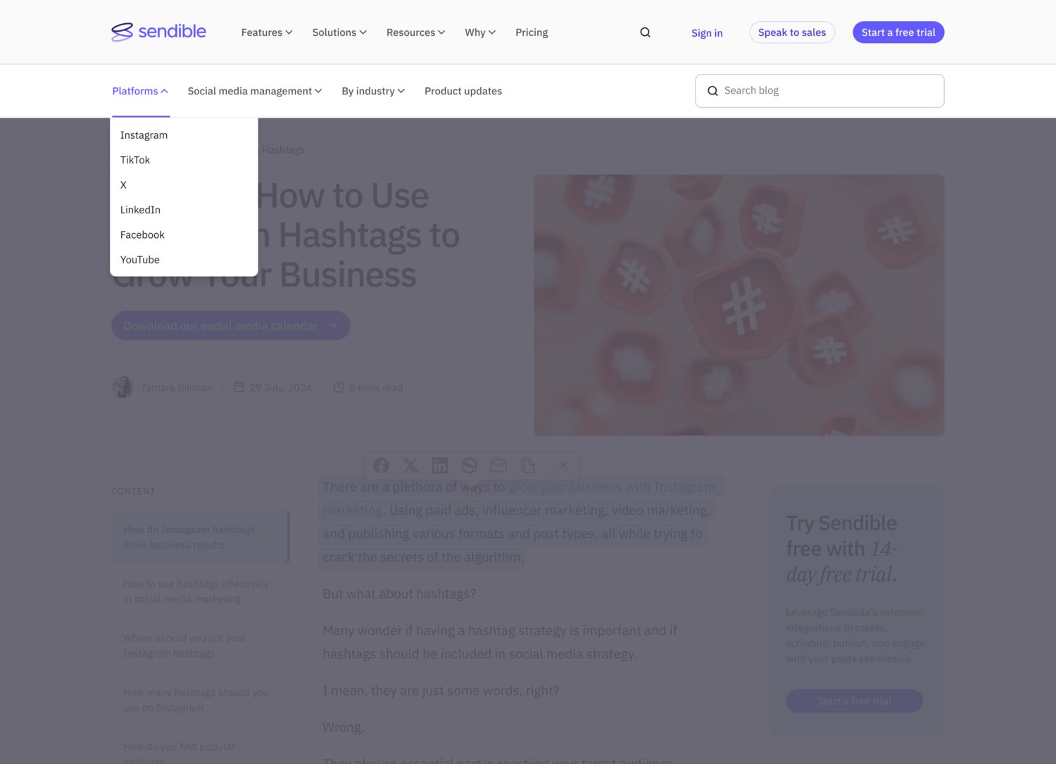
This is what made the tagging problem solvable. The old system showed one tag per article, chosen by the CMS based on tag strength, and used that same weak signal to pick the related articles beneath. Replacing it with an explicit structure meant a reader could navigate the library rather than depending on what the system guessed they wanted.
Article template
Rebuilt against a defined structure rather than a set of preferences:
- Heading, then a CTA to a relevant resource
- Feature image
- Intro, then a table of contents sitting on the cluster colour
- Body sections where no text block runs long without a branded image, a CTA or a blockquote to break it
- A sticky anchor menu on the left for moving within long pieces
- A sticky, editable promotion on the right, so the feature being promoted matches the article
- Tags at the bottom where they belong, and related articles at the end
Sharing became something you do while reading, not after. Select any passage and a bar appears offering to share it or copy it. The old model assumed a reader finishes an article and then decides to share it. In practice people find one line worth passing on, halfway down, and the friction of scrolling to a share button loses most of them.
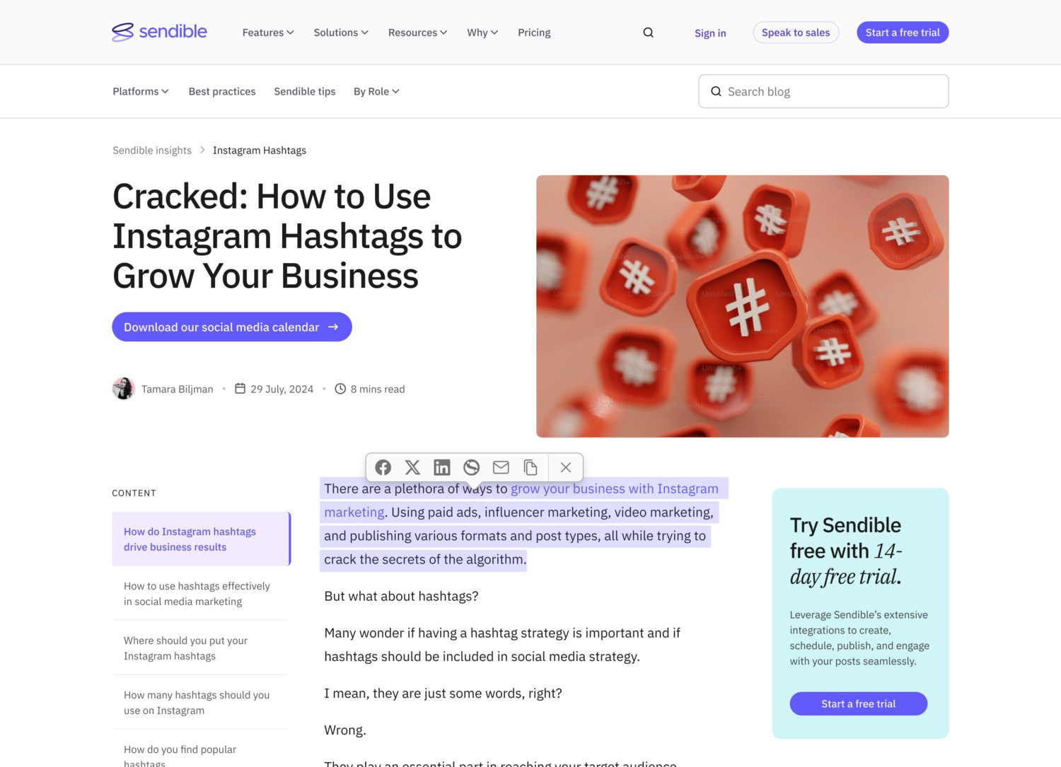
And the ending changed. Articles used to finish with “Wrapping Up.” They now finish with “How Sendible can help you [do the thing this article is about]” and a call to action chosen to match, trial, feature page, or demo.

The table of contents and sticky menu were argued for on engagement grounds, a reader who can move around a long article stays in it, and session length feeds back into how the piece performs in search. That’s the rare change that serves the reader and the ranking in the same move.
Front page
The old page offered tags and a list. The new one is built as an entry hall.
Lead capture moved to the top of the page. The newsletter form sits in the header rather than at the foot, where it had been collecting whoever happened to scroll that far. On a page whose visitors mostly arrive from search and leave from the same screen they landed on, the difference between top and bottom is most of the audience. A prominent lead article with featured pieces beside it. Those featured pieces are not chosen by hand. They pull automatically from the same tag as the lead article, so the top of the page always presents one topic rather than an assortment.
That has three effects. Publish a post about Instagram and the whole top block becomes about Instagram, which gives a first-time reader a subject rather than a list. Because tag and colour cluster are the same thing, the block arrives in one colour, so the system built for articles does navigational work at page level too. And nobody has to maintain it. The alternative is a curated slot that goes stale the week someone gets busy.
The latest articles section below then excludes whatever is already at the top, so the lead article doesn’t appear twice on the same screen. A small rule, and the difference between a page that looks designed and one that looks generated.
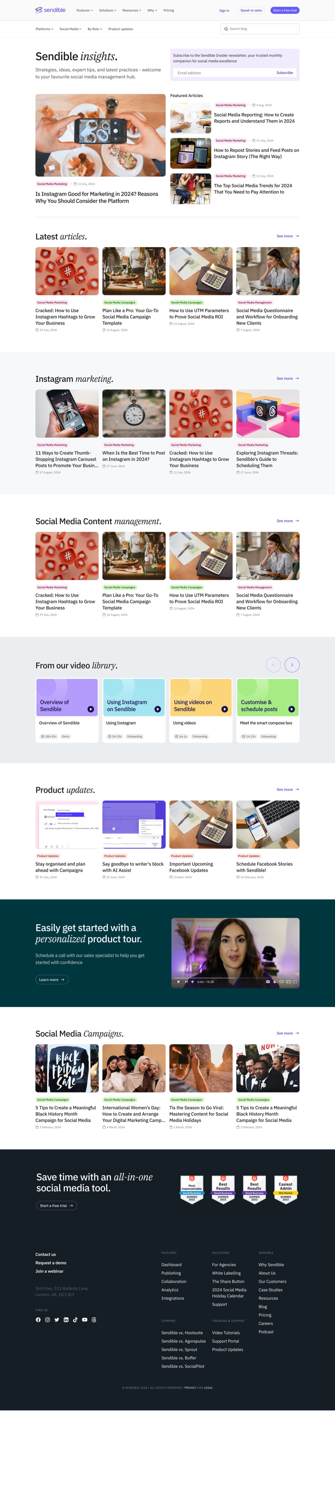
Listing pages went from seven articles to sixteen. It sounds like a small number and it changes browsing completely, one screen of choice instead of three pages of it.
We looked hard at HubSpot, Hootsuite, Sprout Social and Later while doing this. All four had arrived at broadly this structure, which is usually a signal the structure is right rather than a reason to avoid it.
Results
Comparing January against the December before it:
| Before | After | Change | |
|---|---|---|---|
| Contacts | 151 | 249 | +64.9% |
| Conversion rate | 0.37% | 0.53% | +43% |
| Page views | 558 | 1,176 | +110.8% |
| Time per page view | 76 seconds | 80 seconds | +5.2% |
| Bounce rate | 68.1% | 65.9% | −3.3% |
Direct traffic conversion rose sharply, social by 46%, organic search by 10% and 28% against the two comparison periods.
The CTA data showed where volume and rate diverged: the broad resources offer drew 37,320 views at 2.1% click-through, while a narrow audit offer converted at 6.2% on 823 views.
Reading the numbers
That 64.9% is a December comparison, and December is the weakest month of the year for B2B content. Part of that lift is the calendar.
Against the same month a year earlier, contacts rose 3.75% and conversion went from 0.50% to 0.53%. That’s the honest figure, modest, and complicated further by page views having more than doubled, which moves the denominator under every rate in the table.
So the number I’d stand behind is the conversion rate improvement, not the contact count.
What's next
The CTA data points straight at the next test and we never ran it. The broad offer converted at 2.1% across a large audience; a specific one converted at 6.2% across a small one. Nobody had tried matching offer specificity to article intent at scale, the audit offer on articles whose readers are diagnosing a problem, the resource library on articles being read for orientation.
That’s a simple test with a real ceiling, and it needed the conversion architecture in place first. Which is what this redesign built.