
Information architecture · Sendible · 2024–2026 · 12 min read
I spent 2024 making the menu bigger, and 2026 making it smaller
Both were right. That's the case study.
- +22%
- search impressions after the restructure
- 66 → 62
- average keyword position
- 20.82%
- trial conversion from CTA-clickers
What I did
- Started by auditing what the team had already researched, then ran a Miro workshop with marketing and content leads built around three card-sorting exercises
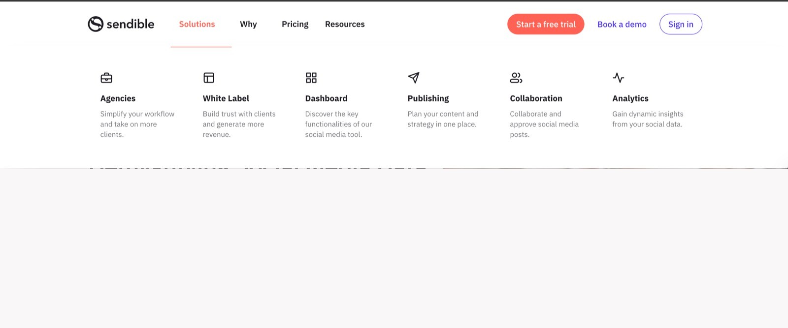
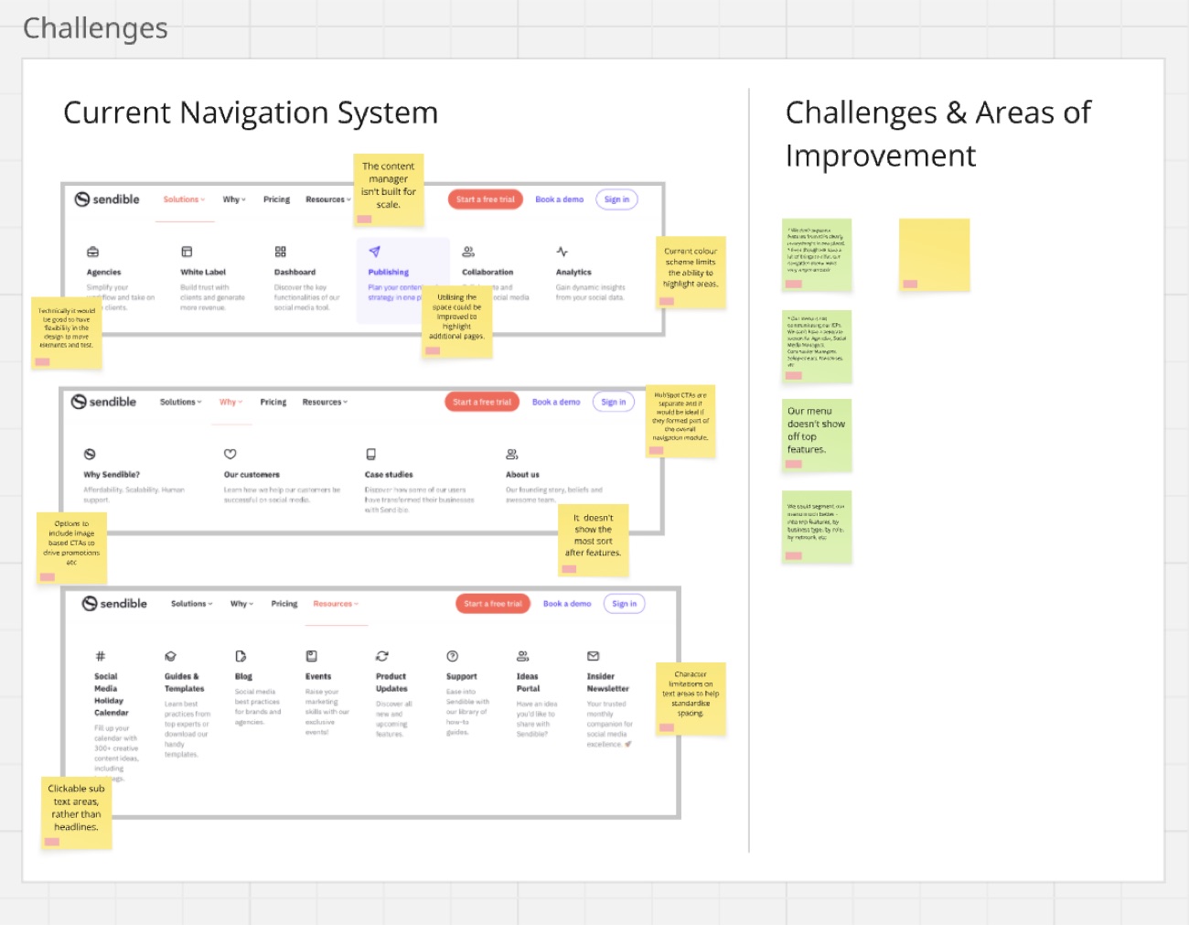
- Diagnosed the current menu from the team’s critique: it looked empty, features and customer types weren’t separated, the layout had no rules, and the CTAs sat outside the module, which is why nothing could be tracked
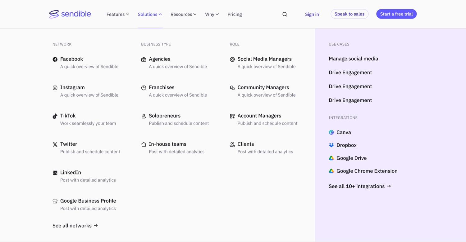
- Designed the information architecture: five parent categories, with Solutions segmented four ways so visitors self-identify however they think of themselves, and every parent carrying its own contextual promotion so the menu promotes rather than lists
- Designed the 2024 mega-menu across its parent categories and the mobile navigation across its states, desktop and mobile together, since the mobile failure was the reason for the project
- Designed site search with categories and tags, filterable before and after the query, so a reader could say which job they were on before the results arrived, and wrote the brief for our external development partner
- Rebuilt the whole thing in 2026 around buying intent rather than product structure, and made the desktop nav sticky, plus a mobile get-started bar, after finding the problem was access, not persuasion
The brief
The ask was commercial, not cosmetic:
“The objective is to drive better visibility of these pages, increase traffic, improve qualified trials/demos and influence MRR.”
The company had been building product content faster than the menu could absorb it. Feature pages, use cases, integrations, comparison pages, a resources library, a help centre, all of it existed, and much of it was effectively invisible.
The brief also flagged something that turned out to matter later: there was no tracking on the navigation at all. No way to see which menu items were used, and no way to attribute a trial to the route someone took to find it.
Prior research
I spent the first week finding what the team already knew instead of redoing it. Simon had reviewed the current navigation. He and Tamara had done user research. Competitor analysis had been started. My planning document is full of lines like “I believe Simon and Tamara have done the research on this and can put me through it” and “this is done, too.”
That sounds like a small thing. It saved several weeks, and it meant the work started from what the team already knew rather than from my own fresh opinions about a business I’d been in for two years and they’d been in longer.
The workshop
I ran a session with Simon and Tamara in Miro, structured around four objectives: understand the current system and how people used it, pull insights from competitors, design a better structure together, and agree a labelling system.
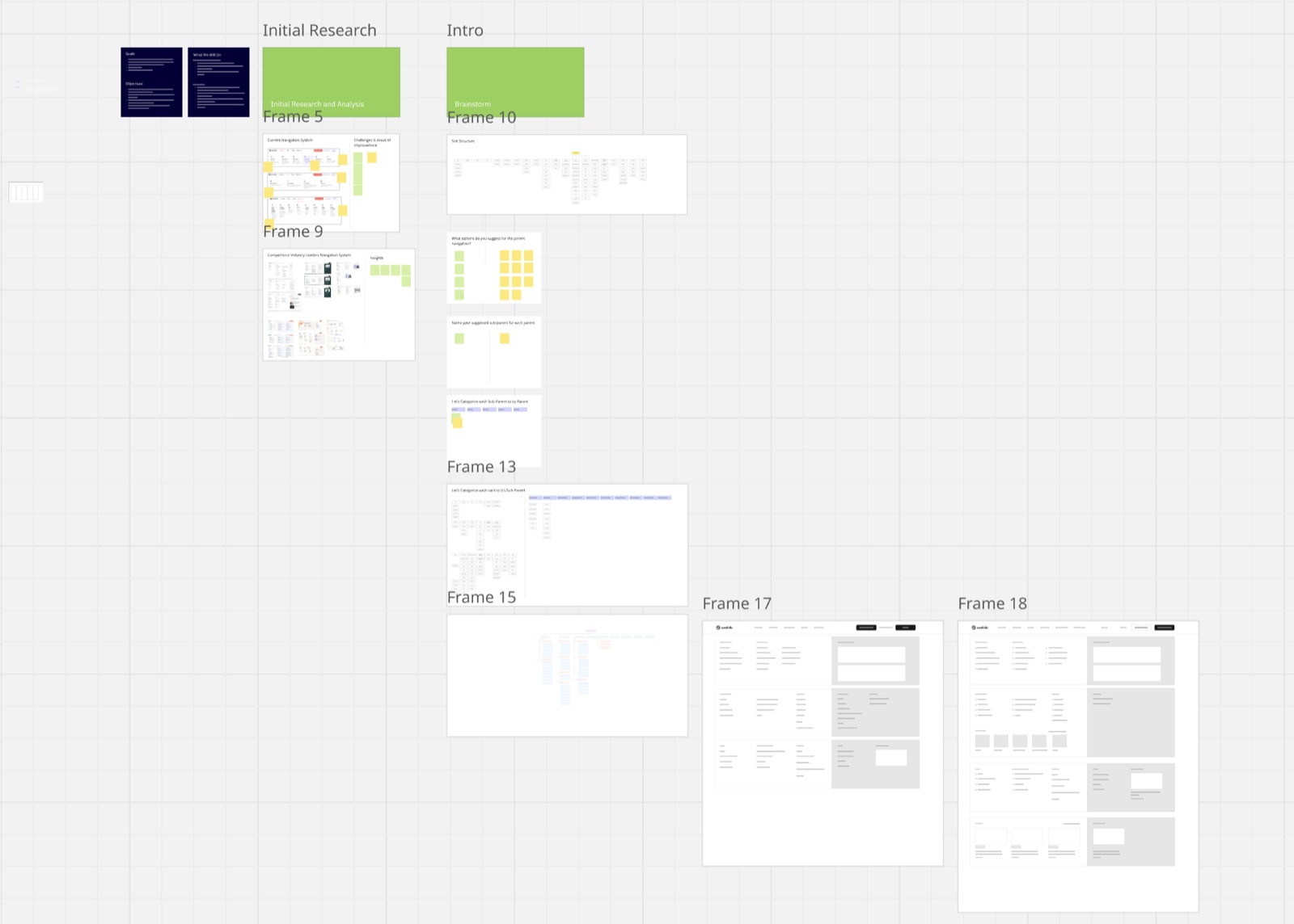
The board ran in sequence. Critique the current navigation. Analyse competitors. Then three card-sorting exercises in order: what options do you suggest for the parent navigation, name your suggested sub-parent for each parent, and let’s categorise each card to its sub-parent.
Card sorting rather than my drawing a structure and asking for feedback. The people in that room knew what customers asked for, what sales fielded, what ranked. Extracting that was the point, my job was to structure it afterwards, not to have the opinions myself.
Findings
The critique produced a list. Some of it was visual, most of it wasn’t.
The menu looked empty despite having a great deal behind it. That was the headline. A company with five core features, nine top features, four business types, four roles, seven networks and twenty-plus integrations was presenting a menu that could have belonged to a much smaller product.
Features and customer types weren’t separated. An agency looking for white-label and a solo marketer looking for scheduling were being sent down the same undifferentiated path.
The layout had no rules. No character limits on text areas, which meant spacing drifted every time someone added an item. No room for image-based promotion. No flexibility to move things and test them.
And the calls to action sat outside the navigation module entirely, which is why nothing could be tracked. The CTAs in the menu were separate objects; bringing them inside the module was the only way to attribute anything to it.
The architecture
I analysed competitor and industry-leader navigation systems, pulled out what they had in common, and proposed a structure.
Five parent categories, plus calls to action and search:
- Features split into core and top, because the two answer different questions
- Solutions segmented by business type, role, use case and network, so a visitor can self-identify however they think of themselves
- Resources learn, connect, product resources
- Pricing
- Enterprise
And a rule underneath: every primary category carries its own contextual CTA, an upcoming event, a new report, a recent article, a feature in development, so the menu promotes rather than just lists.
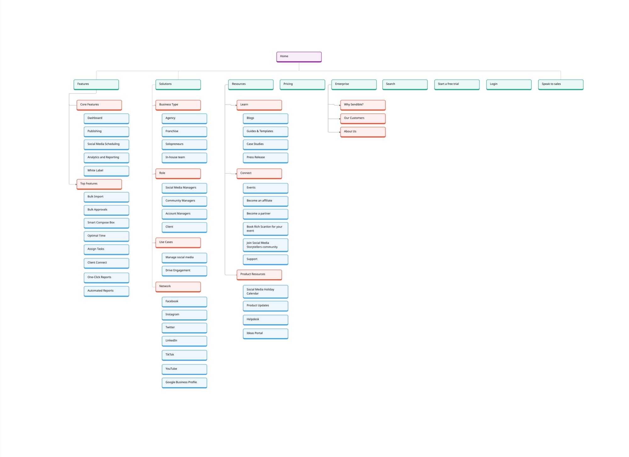
The Solutions branch is the one I’d point at. Four different ways of segmenting the same audience, sitting side by side, because there’s no single right answer to what kind of customer are you agencies think of themselves as agencies, social media managers think of themselves by role, and a lot of people arrive thinking about one specific network.
The design
Built with our external development agency across February and March, desktop and mobile designed together rather than one adapted from the other.
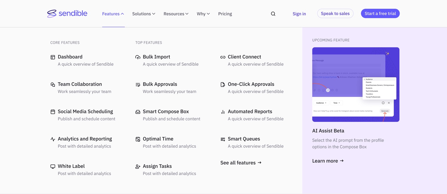
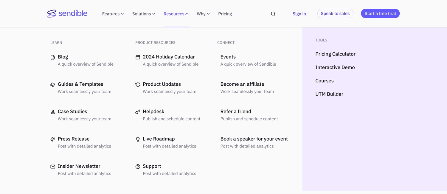

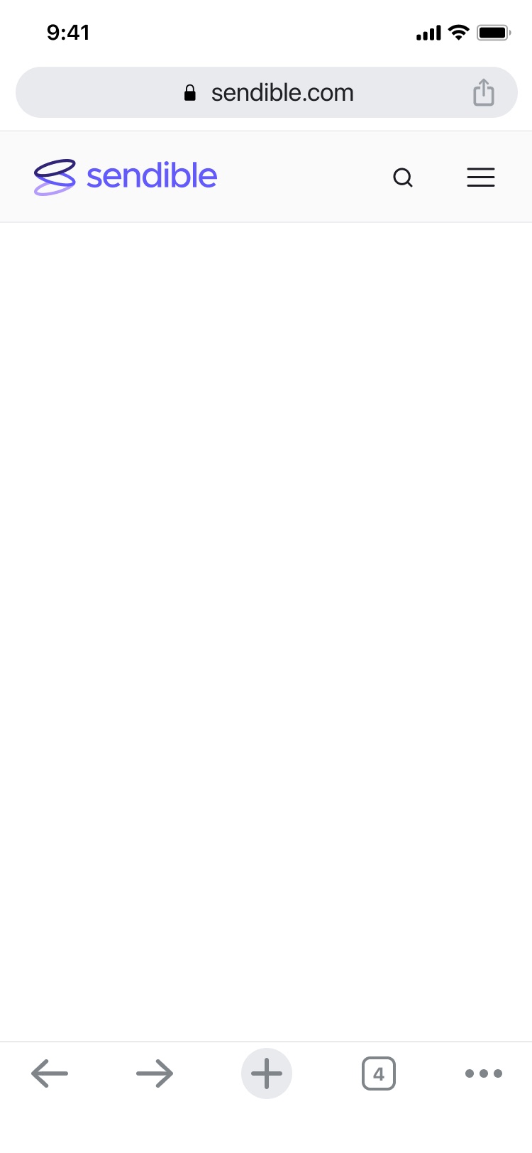
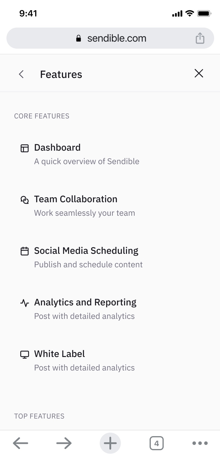
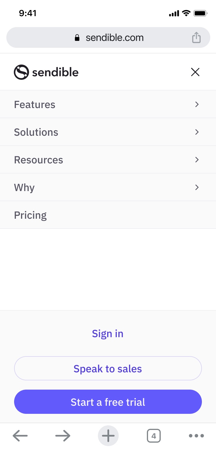
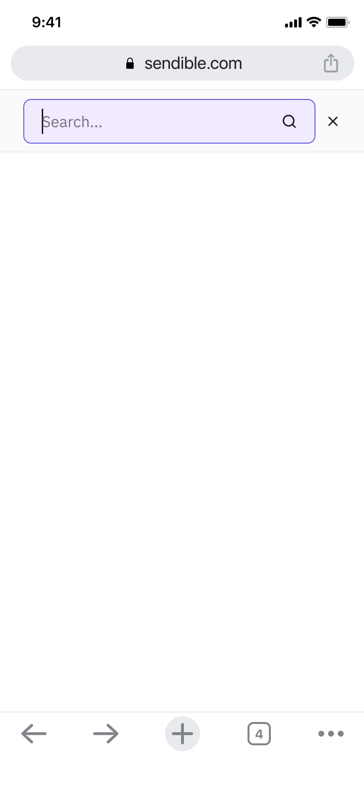
The review threw up the questions that always come up, CTA height, tab behaviour, whether anchor links should move within a page or across pages, and I worked those through with the agency.
It looks awesome, well done running this project with HubSnacks.
Search
The site had grown a library and no way to look through it.
Features, use cases, comparisons, integrations, a blog, a resources section, a help centre. All of it existed. None of it was searchable.
The requirements sharpened what search had to do: draw from support content as well as the marketing site, carry campaign tracking so we could see what search contributed, highlight matched terms, and show breadcrumbs so a reader knew which part of the site a result came from.
What I designed
Search with tags and categories, filterable before and after the query.
The reason matters more than the feature. On a site like this one, a single word means several different things depending on who’s asking. Type Instagram and you could reasonably want the Instagram feature page, the Instagram integration, a blog post on scheduling Stories, or a help article on reconnecting a profile that keeps dropping.
Those aren’t degrees of the same answer. They’re different jobs. A prospect comparing tools and a customer with a broken connection are looking for opposite ends of the site, and a single ranked list serves whichever one the relevance algorithm happens to favour.
Categories let the person say which they were before the results arrived. Tags let them narrow after.
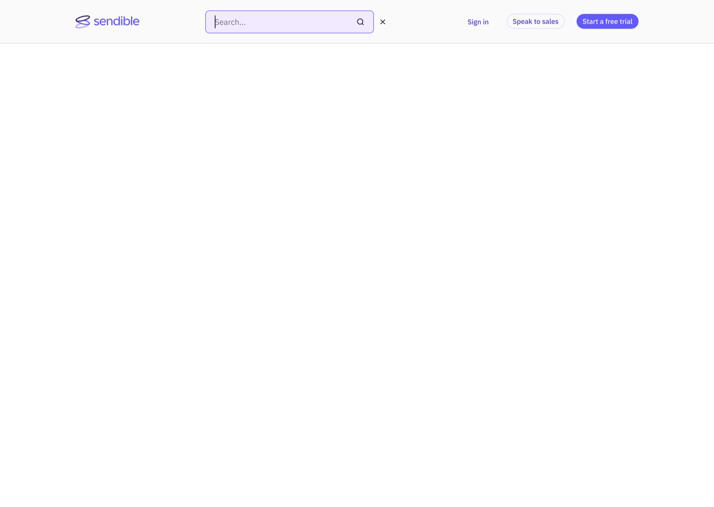
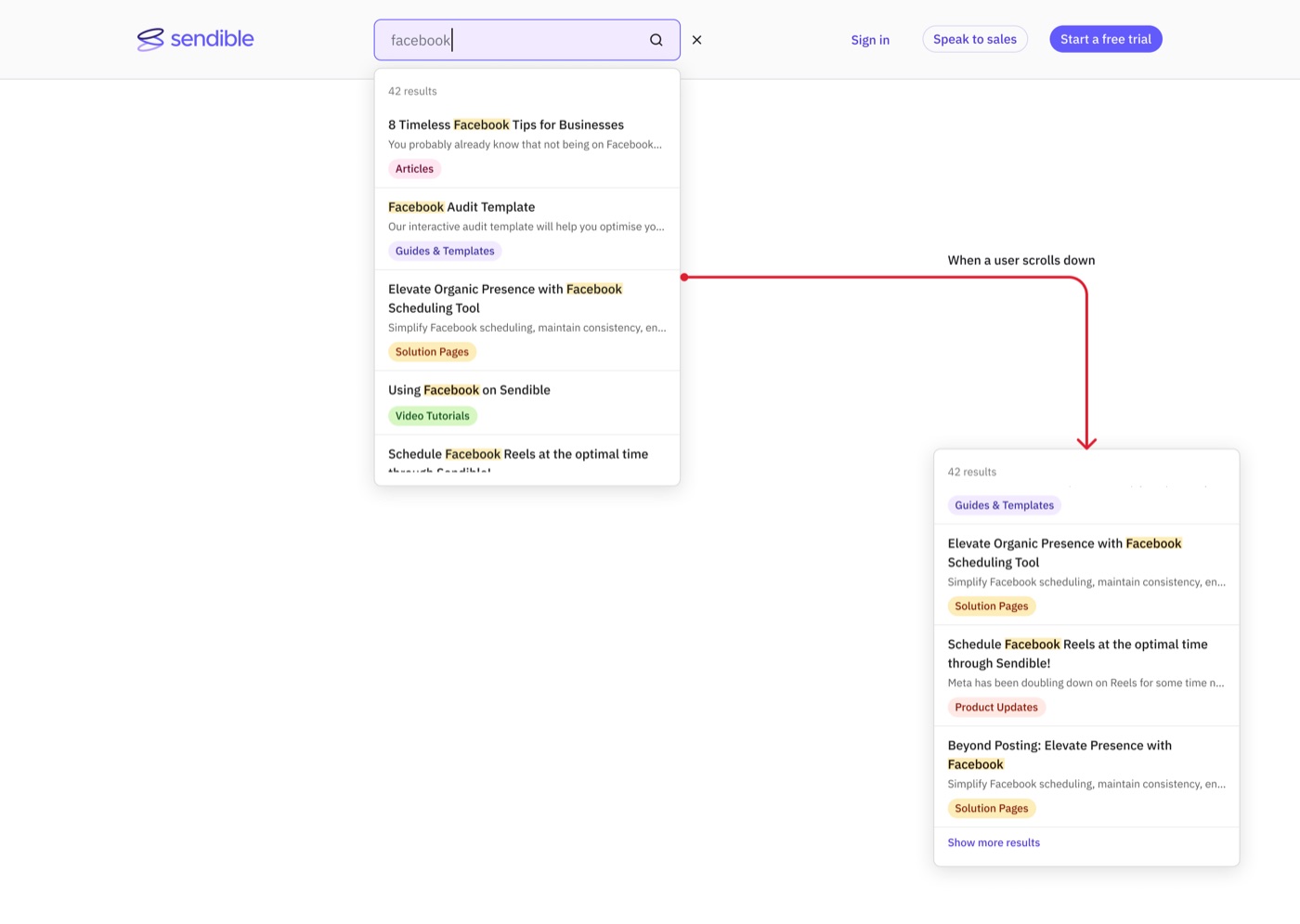
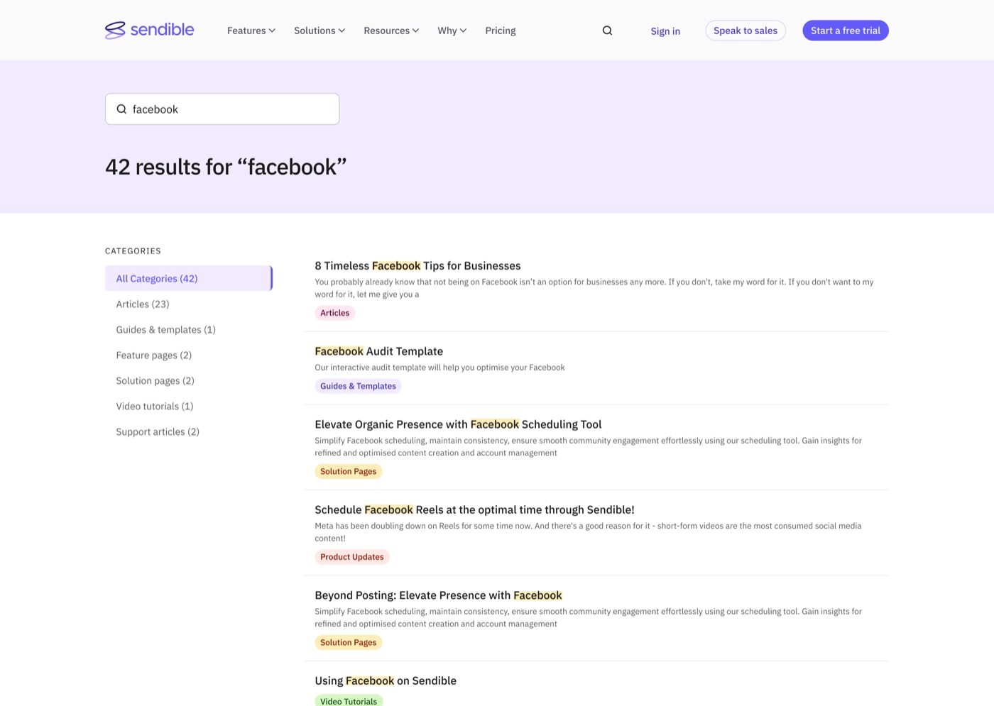
There’s a connection worth naming here. Two years later I rebuilt the whole navigation around where a visitor sits in deciding rather than around what the product contains. This search design was the same instinct, arriving early and on a smaller surface.
What shipped
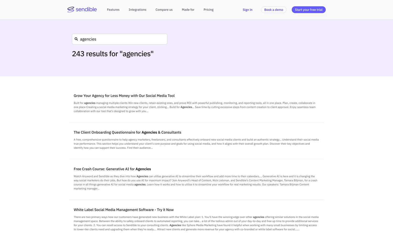
A single search field and a ranked list of results.
The constraint was our content management system. Faceted filtering across page types meant reconciling how our CMS separates site pages, blog posts and knowledge base articles, and our external development partner couldn’t make that work against the setup we had within the time the project had.
So we cut it. Highlighting stayed, campaign tracking stayed, support content stayed in the index, and breadcrumbs stayed.
The trade-off
Breadcrumbs turned out to carry more of the load than they were designed to. A result labelled Help centre rather than Blog tells a reader what kind of answer they’re about to get, which is the same signal categories would have exposed.
But telling someone where a result came from is not the same as letting them choose before they search. The shipped version puts the work on the reader, after the fact, one result at a time. The designed version would have removed the work entirely.
What I’d do differently is check the implementation constraint earlier. I designed the filtering, then found out what our CMS made expensive. Half a day with the development partner before the design stage would have told me the same thing, and I’d have spent the effort on ranking instead, which was achievable and would have addressed some of the same problem.
Reviewed and shipped in September.
What it did
The brief had noted there was no tracking on the navigation. We added CTA tracking inside the module, but nobody built a dashboard for the navigation as a whole.
So in December I went back to our head of content marketing and asked what it had done.
I ask this a lot, and it isn’t diligence so much as appetite, I find the data more interesting than the design, and she’s the person who made it fun. She lives in Search Console and analytics the way other people live in Figma, and asking her what happened after something ships is genuinely one of the better parts of the job. Half the time the answer is nothing much. Occasionally it’s this.
We restructured a menu to help people find things, and changed how a search engine understood the entire site. Google had started pulling content from the new navigation into the “People also ask” panel and the sitelinks under our homepage result, lifting click-through to our product pages from search.
Search impressions rose 22% over the same period, average keyword position from 66 to 62, and click-through up 1.75%.
Her analysis, not my measurement. I asked the question; she had the answer.
2026 · Simplifying
Two years later I took the navigation apart again, and reversed most of what I’d done.
The 2024 menu had been built to show that Sendible was bigger than it looked. It worked. And then the team kept adding, new feature pages, new integrations, new use cases, new comparison content, all of it correctly filed into the structure I’d built for exactly that purpose.
By 2026 the menu could hold everything, and that had become the problem. A structure designed to reveal a large product was now asking a first-time visitor to parse a large product.
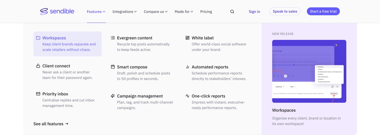
We rebuilt it on customer journey data, page velocity reports and heat maps showing where visitors were and weren’t clicking. Every parent category changed its basis:
| 2024 | 2026 | What changed |
|---|---|---|
| Features: core and top, comprehensive | Features: nine that lead to fast conversion | From what we have to what closes |
| Solutions: business type, role, use case, network | Integrations: six networks, three creative tools | From who you are to what you already use |
| Resources: learn, connect, product | Compare us: five competitors plus a buyer toolkit | From what we publish to what you’re weighing us against |
| Why | Made for: perfect fit, property and local, specialised verticals | From our argument to your situation |
The 2024 architecture was organised around what the product contains. The 2026 architecture is organised around where the visitor is in deciding. Someone comparing tools gets a comparison section, not a resources library. Someone checking whether we work with their stack gets integrations, not a solutions taxonomy.
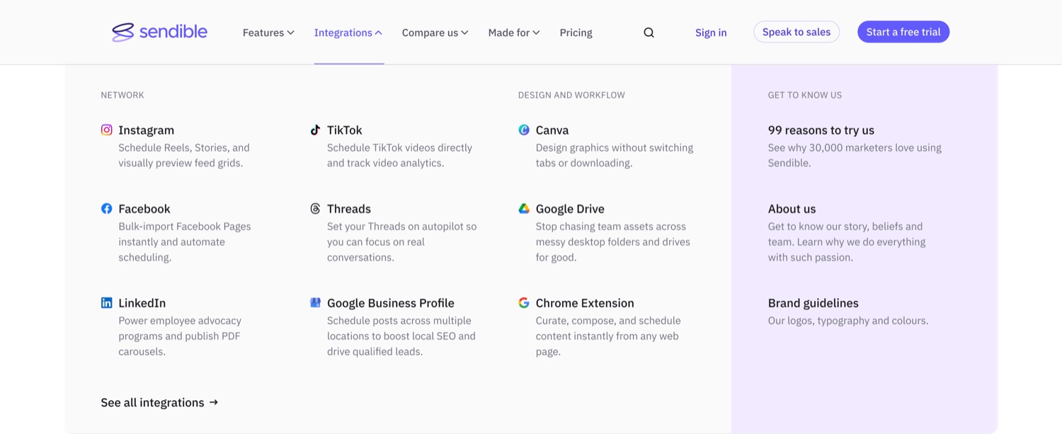
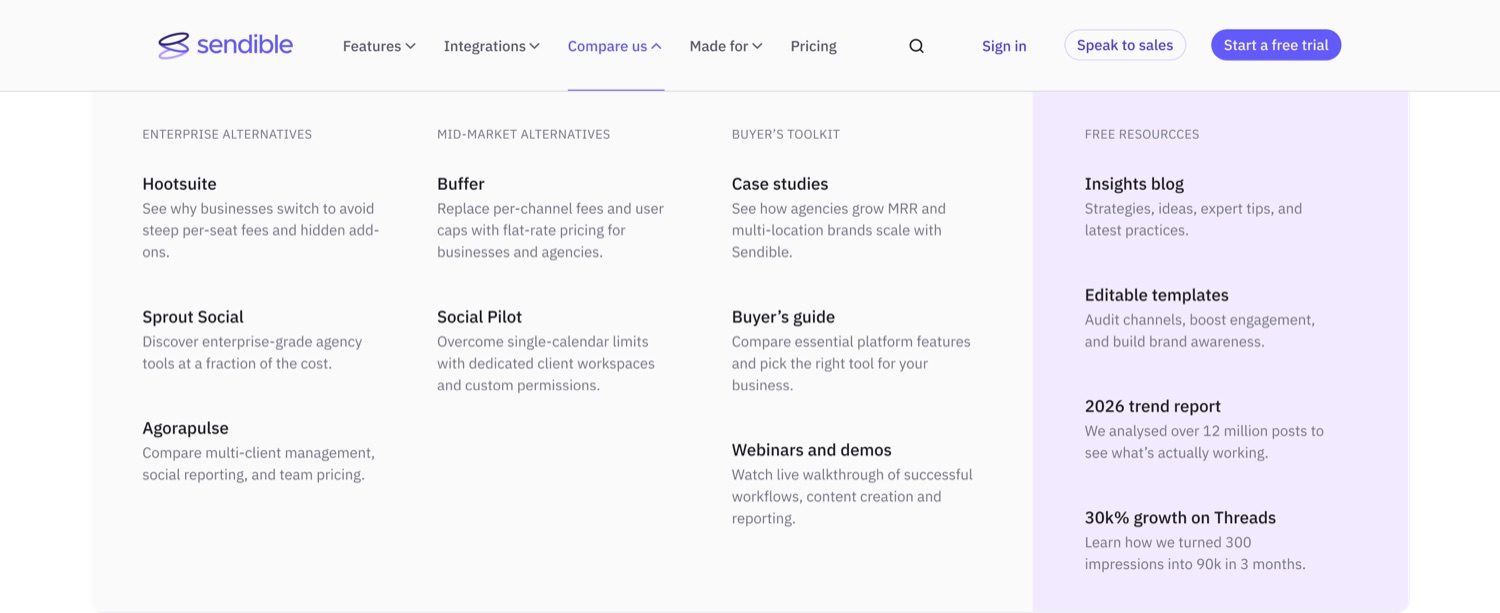
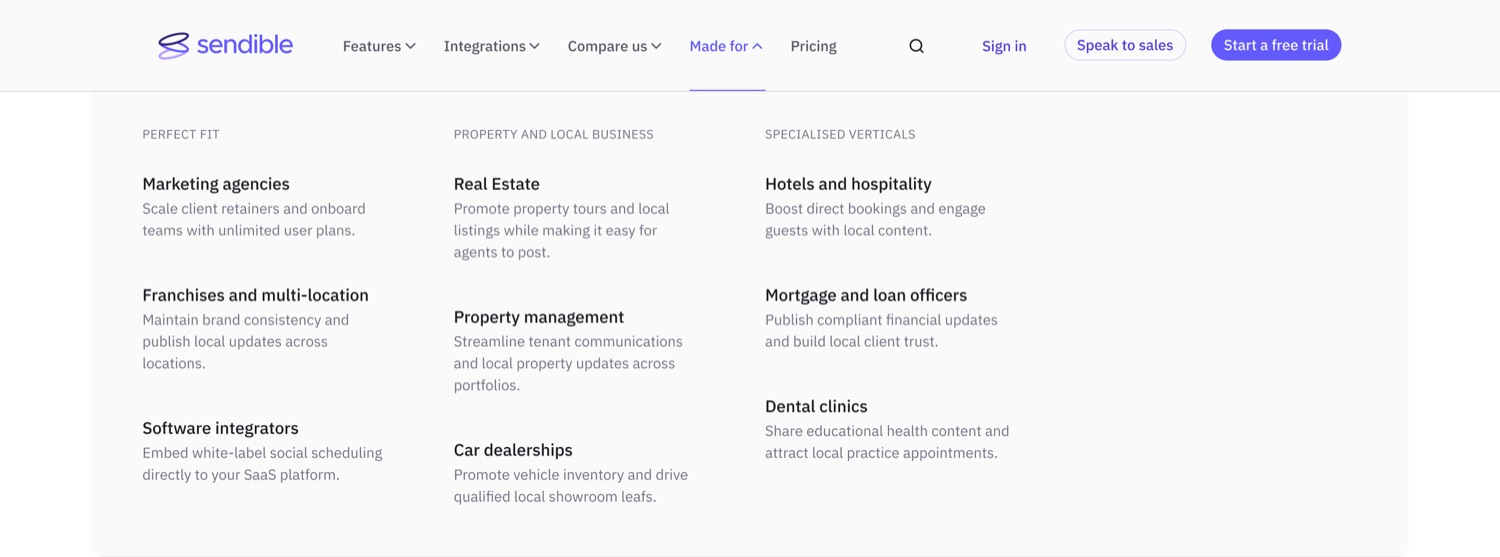
That’s not a correction of the earlier work. It’s what the earlier work made possible, you can’t reorganise around buying intent until the content exists and is structured well enough to be moved.
Access, not persuasion
The other half of the 2026 work came out of a single observation.
Only 0.78% of homepage visitors clicked a call to action. But the ones who did converted at 20.82%, and people who submitted the form directly converted at 35.5%.
The problem isn’t persuasion; it’s access.
Session recordings confirmed it, we watched people scroll back to the top of the page hunting for the trial button. So the desktop navigation became sticky: it stays with you rather than disappearing as you scroll.
I shipped it to everyone rather than as a split test, which makes it a before-and-after comparison rather than a controlled one, and said so at the time. We watched scroll depth and bounce rate in case a persistent header irritated people more than it helped them.
The next step was a sticky Get started for free bar along the bottom of the screen on mobile, appearing once you scroll past the hero, same principle, applied where the problem was worst.
That sequence is the whole 2026 chapter in miniature. The number that looked like a persuasion problem was an access problem, and the fix was structural rather than rhetorical.
What I take from it
I built a menu in 2024 to make a company look as substantial as it was. I rebuilt it in 2026 because being substantial had stopped being the useful thing to communicate.
Both decisions were right for the site they were made on, and the second only became possible because of the first. An information architecture isn’t a solution you arrive at, it’s a position you hold for as long as the content and the audience make it true. Two years is a normal lifespan. Treating a structure as permanent is how it quietly stops working while everyone assumes it’s fine.
What made both versions possible was working somewhere the data was close at hand. The 2024 outcome came out of a conversation with our content lead. The 2026 rebuild came out of customer journey reports, page velocity data, heat maps and session recordings. Navigation is the least-measured surface on most websites and one of the most consequential, and the only reason we knew anything about ours is that the people holding the numbers were people I talked to constantly.
The duller thing I’d carry forward: in 2024 I spent the first week finding out what the team had already researched instead of doing it again. The workshop worked because it built on their knowledge rather than replacing it, my structure, their understanding of the customer, rather than the other way round.